WPF Expander 按钮样式带有 + 和 -

5

样式专家,我需要帮助设计一个类似于Visual Studio代码编辑器中的扩展风格。目前,我想到了这个样式:

<ControlTemplate x:Key="ExpanderToggleButton" TargetType="ToggleButton">               
                <Border
                    SnapsToDevicePixels="true"
                    Height="12" 
                    Name="Border"
                    CornerRadius="0"                   
                    Margin="2,4" 
                    Background="Transparent"                      
                    BorderBrush="Black"                       
                    BorderThickness="0.5" >                   
                <TextBlock  Name="Arrow" Text="+"  
                            Foreground="{StaticResource GlyphBrush}" 
                            HorizontalAlignment="Center"  VerticalAlignment="Center" />
            </Border>
                <ControlTemplate.Triggers>                  
                <Trigger Property="IsChecked" Value="true">                      
                    <Setter TargetName="Arrow" Property="Text" Value="-" />
                </Trigger>                 
            </ControlTemplate.Triggers>
        </ControlTemplate>

在折叠状态下,它看起来像这样。 enter image description here 
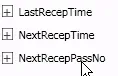
很明显它需要一些微调,这就是我需要帮助的地方。我的挑战在于获取正确的按钮内容及其垂直对齐方式。在附加的图中,展开器只是被添加到一个停靠面板中,所以我不理解为什么按钮内容没有按照指定的位置居中。
谢谢您。
1个回答

10

这是我使用的一种样式。

<Style x:Key="ExpandCollapseToggleStyle" TargetType="ToggleButton">
    <Setter Property="Focusable" Value="False"/>
    <Setter Property="Template">
        <Setter.Value>
            <ControlTemplate TargetType="ToggleButton">
                <Grid Width="14" Height="14">
                    <Rectangle Fill="{DynamicResource primaryBackgroundBrush}" />
                    <Border Name="ExpandBorder" RenderOptions.EdgeMode="Aliased" BorderBrush="Black" BorderThickness="2">
                        <Path RenderOptions.EdgeMode="Aliased" Name="ExpandPath" Stroke="Black" Margin="0" StrokeThickness="2" Data="M 5 1 L 5 9 M 1 5 L 9 5" />
                    </Border>
                </Grid>
                <ControlTemplate.Triggers>
                    <Trigger Property="IsChecked" Value="True">
                        <Setter Property="Data" TargetName="ExpandPath" Value="M 1 5 L 9 5"/>
                    </Trigger>
                    <Trigger Property="IsEnabled" Value="False">
                        <Setter TargetName="ExpandBorder" Property="BorderBrush" Value="Gray" />
                        <Setter TargetName="ExpandPath" Property="Stroke" Value="Gray" />
                        <Setter Property="Data" TargetName="ExpandPath" Value=""/>
                    </Trigger>
                </ControlTemplate.Triggers>
            </ControlTemplate>
        </Setter.Value>
    </Setter>
</Style>

1
那是一个根据用户主题设置的动态资源。现在看来,我意识到它可以移动到控件边框的背景中。 - Brady
1
非常好,谢谢。然而,它有一个小问题,例如如果您将边框和矩形厚度减少到1,则矩形不再居中于网格中。 - Klaus Nji
@Klaus Nji - 我通过将Path元素放在Grid中来解决了这个问题。例如:<Grid><Path ... /></Grid> - Shankar Raju
Brady +1 - 很棒的解决方案! - Shankar Raju
2
将此复制到 Window.Resources(并添加缺少的</Style>标记)时,没有任何反应。有没有特殊的方法告诉扩展器使用其切换按钮的样式?这个答案是否已过时(自7年前以来)? - FrankM
显示剩余3条评论

网页内容由stack overflow 提供, 点击上面的
可以查看英文原文,
原文链接