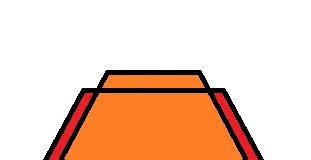
CSS - 矩形 div 带切角和边框颜色

3

我想要实现这张图片中展示的形状:
有两个带切角的矩形div,以及一个位于另一个div后面的div。

enter image description here

但是角落似乎不正确,我找不到显示形状边框的方法。

.wrapper {
  display: flex;
  justify-content: center;
}

.connect {
  width: 254px;
  height: 50px;
  background: red;
  background: #FF2D5069;
  border-top: 2px solid #FF2175;
  position: absolute;
  bottom: 0;
  z-index: 5;
}

.connect::before {
  content: '';
  position: absolute;
  bottom: 0;
  right: -2px;
  border-top: 52px solid white;
  border-left: 42px solid transparent;
}

.connect::after {
  content: '';
  position: absolute;
  bottom: 0;
  left: -2px;
  border-top: 52px solid white;
  border-right: 42px solid transparent;
}

.connect-behind {
  width: 300px;
  height: 44px;
  background: red;
  background: #FF2D5069;
  border-top: 2px solid #FF2175;
  position: absolute;
  bottom: 0;
}

.connect-behind::before {
  content: '';
  position: absolute;
  bottom: 0;
  right: -2px;
  border-top: 46px solid white;
  border-left: 26px solid transparent;
}

.connect-behind::after {
  content: '';
  position: absolute;
  bottom: 0;
  left: -2px;
  border-top: 46px solid white;
  border-right: 26px solid transparent;
}
  <div class="wrapper">
    <div class="connect"></div>
    <div class="connect-behind"></div>
  </div>

我参考了其他帖子,使用behindafter来解决问题,但似乎对我的问题不起作用。请帮忙,谢谢。

为什么不使用类似SVG的东西呢? - Rahul Kadukar
3个回答

6
你可以使用 perspective 和 transform:
可能的示例(有网格而不是绝对定位):

.wrapper {
  display: grid;
  justify-content: center;
  align-items: end;
  height: 300px;
  perspective: 50px;
}

.connect,
.connect-behind {
  transform: rotatex(50deg);
  background: red;
  margin: 0 auto;
  background: #FF2D5069;
  border-top: 2px solid #FF2175;
  grid-row: 1;
  grid-column: 1;
  transform-origin: bottom center;
}

.connect-behind {
  width: 300px;
  height: 44px;
}

.connect {
  width: 254px;
  height: 50px;
  ;
}
<div class="wrapper">
  <div class="connect"></div>
  <div class="connect-behind"></div>
</div>

可使用drop-shadow为形状绘制边框阴影

.wrapper {
  display: grid;
  justify-content: center;
  align-items: end;
  height: 300px;
  perspective: 50px;
   filter:
   drop-shadow( 1px  0px 0 )
   drop-shadow(-1px  0px 0 )
   drop-shadow( 0px  1px 0 )
   drop-shadow( 0px -1px 0 );
}

.connect,
.connect-behind {
  transform: rotatex(50deg);
  background: red;
  margin: 0 auto;
  background:white;
  grid-row: 1;
  grid-column: 1;
  transform-origin: bottom center; 
  background:#ffa500;
}

.connect-behind {
  width: 254px;
  height: 50px; 
  border-left:solid 2px;
  border-right:solid 2px;
}

.connect {
  background:#ed1c24;
  width: 300px;
  height: 44px;
  ;
}
<div class="wrapper">
  <div class="connect"></div>
  <div class="connect-behind"></div>
</div>


如何为形状添加边框颜色。 - hatched
@hatched 你可以将边框设置为元素本身。或者你只需要在形状周围设置边框吗? - G-Cyrillus
感谢您的解决方案,它非常有效。 - hatched

2

您可以使用clip-path实现这样的效果。它在大多数浏览器中都能很好地工作(我认为)。然而,像IE11和旧版浏览器之类的浏览器无法正确呈现它,所以您可能需要为这些情况提供备用方案。

body {
overflow: hidden;
}

.wrapper {
  display: flex;
  justify-content: center;
}

.connect {
  width: 254px;
  height: 80px;
  background: red;
  background: #FF2D5069;
  border-top: 2px solid black;
  position: absolute;
  bottom: 0;
  z-index: 5;
  clip-path: polygon(20% 0%, 80% 0%, 100% 100%, 0% 100%);
}

.connect-border-left {
    height: 80px;
    width: 2px;
    background: black;
    left: calc(50% - 131px);
    position: absolute;
    bottom: -12px;
    transform: rotate(34deg) translateX(-50%);
    display: inline-block;
}

.connect-border-right {
    height: 80px;
    width: 2px;
    background: black;
    right: calc(50% - 131px);
    position: absolute;
    bottom: -12px;
    transform: rotate(-34deg) translateX(-50%);
    display: inline-block;
}


.connect-behind {
  width: 300px;
  height: 60px;
  background: red;
  background: #FF2D5069;
  border-top: 2px solid black;
  position: absolute;
  bottom: 0;
  clip-path: polygon(14% 0%, 86% 0%, 100% 100%, 0% 100%);
}

.connect-behind-border-right {
    height: 100px;
    width: 2px;
    background: black;
    right: calc(50% - 103px);
    position: absolute;
    bottom: -11px;
    transform: rotate(-32deg) translateX(-50%);
    display: inline-block;
}

.connect-behind-border-left {
    height: 100px;
    width: 2px;
    background: black;
    left: calc(50% - 103px);
    position: absolute;
    bottom: -11px;
    transform: rotate(32deg) translateX(-50%);
    display: inline-block;
}
<div class="wrapper">
    <div class="connect"></div>
    <div class="connect-border-left"></div>
    <div class="connect-border-right"></div>
    <div class="connect-behind"></div>
    <div class="connect-behind-border-left"></div>
    <div class="connect-behind-border-right"></div>
  </div>


有没有办法也在侧边添加黑色边框? - hatched
是的,您可以使用其他div并在项目两侧正确定位它们。 剪裁的项目(如多边形)不允许在侧面上有边框,因为它们的原始形状是正方形或矩形,因此边框不能正确显示。 - yerme
1
非常感谢您提供的解决方案。运行得非常好。 - hatched

1
使用斜切变换、剪裁路径和多重背景的想法:

.box {
  --b:3px;   /* border width */
  --t:20px; /* top part width */
  --s:30px; /* side part width */
  margin:10px;
  display:inline-block;
  width:250px;
  height:150px;
  position:relative;
}
.box::before,
.box::after {
  content:"";
  position:absolute;
  top:0;
  bottom:0;
  left:0;
  width:50%;
  border-style:solid;
  border-width:var(--b) 0 0 var(--b);
  background:
    linear-gradient(black 0 0) 0 var(--t)/100% var(--b),
    linear-gradient(black 0 0) var(--s) 0/var(--b) 100%,
    linear-gradient(red 0 0)  left/var(--s) 100%, 
    orange;
  background-repeat:no-repeat;
  transform-origin:bottom right;
  transform:skew(-20deg);
  clip-path:polygon(0 calc(var(--t) + var(--b)), calc(var(--s) + var(--b)) calc(var(--t) + var(--b)),calc(var(--s) + var(--b)) 0,60% 0,100% 100%,0 100%);
}
.box::after {
  transform:scale(-1,1) skew(-20deg);
 }
<div class="box"></div>
<div class="box" style="--b:2px;--t:30px;--s:15px;"></div>


网页内容由stack overflow 提供, 点击上面的
可以查看英文原文,
原文链接