以下图表的图例是否可以重新排列
plot(1,1, type="n")
legend("topleft", c("1", "2"), col=c("darkblue", "darkred"), pch = 1, bty = "n", horiz = T, lwd=1.25, cex=1.8)
要让形状看起来像这样(“点-线-点”模式)?
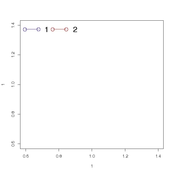
points()、lines()/segments()、text()等),并且需要从绘图参数(例如par('usr'))进行谨慎的计算来手动完成。这并不容易。以下是一个示例,展示了如何完成此操作:point.line.point <- function(x1,y1,x2=x1,y2=y1,...) {
points(c(x1,x2),c(y1,y2),...);
segments(x1,y1,x2,y2,...);
};
legend.plp <- function(x,y,labels,col,linewidth=diff(par('usr')[1:2])/10,textgap=diff(par('usr')[1:2])/20,...) {
comb <- cbind(labels,col);
xc <- x;
for (i in seq_len(nrow(comb))) {
x2 <- xc+linewidth;
point.line.point(xc,y,x2,col=comb[i,'col'],...);
text(x2+textgap,y,comb[i,'labels'],...);
xc <- x2+textgap*1.5+strwidth(comb[i,'labels']);
};
};
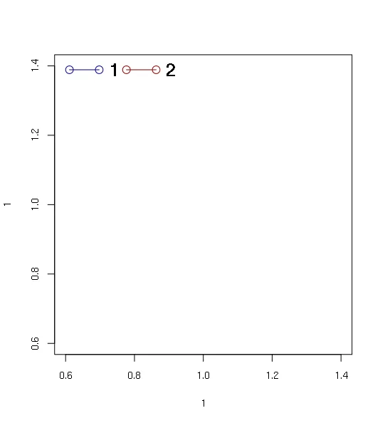
plot(1,1,type="n");
legend.plp(par('usr')[1]+diff(par('usr')[1:2])/20,par('usr')[4]-diff(par('usr')[3:4])/20,1:2,c('darkblue','darkred'),font=2,cex=1.5);
这里有一种相反于优雅的替代方案。它涉及嵌入几个图形(每个图形对应一个图例)以及大量手动操作(将“图例”设置到您想要的位置):
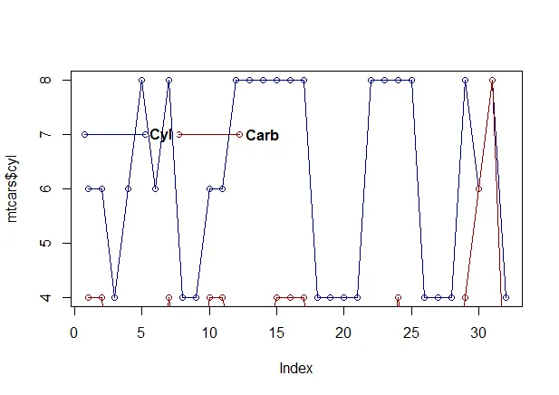
library(Hmisc)
data(mtcars)
#plots the one in blue
plot(mtcars$cyl, type="o", col="darkblue")
#plots the one in red
lines(mtcars$carb, type="o", col="darkred")
#name the legends
text(6.5,7, "Cyl", font=2)
text(14,7, "Carb", font=2)
#add the subplots, it's actually a normal plot wrapped around the subplot with the x and y positions
subplot(plot(c(1,0),c(1,1), xlab=NA, ylab=NA, xaxt="n", yaxt="n", col="darkblue", type="o", axes=FALSE), 3, 7)
subplot(plot(c(1,0),c(1,1), xlab=NA, ylab=NA, xaxt="n", yaxt="n", col="darkred", type="o", axes=FALSE), 10, 7)