CSS3动画钟摆效果

4
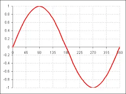
我希望用纯CSS实现摆钟效果,但是不够流畅。这是我想要的效果,但是需要使用纯CSS实现:http://www.webdevdoor.com/demos/html5-pendulum-demo/。但我更喜欢它看起来更像自然速度变化,根据其位置进行调整。以下是相关代码:Fiddle

.bellImg {
  height: 20px;
  width: 20px;
  position: absolute;
  right: 10px;
  top: 18px;
  -webkit-animation-name: rotate;
  animation-delay: 3s;
  -webkit-animation-duration: 2s;
  -webkit-animation-iteration-count: infinite;
  -webkit-animation-direction: linear;
  -webkit-transform-origin: 50% 0%;
  -webkit-animation-timing-function: ease-in-out;
}
@-webkit-keyframes rotate {
  0% {
    -webkit-transform: rotate(0deg);
  }
  10% {
    -webkit-transform: rotate(10deg);
  }
  20% {
    -webkit-transform: rotate(20deg);
  }
  30% {
    -webkit-transform: rotate(10deg);
  }
  40% {
    -webkit-transform: rotate(5deg);
  }
  50% {
    -webkit-transform: rotate(0deg);
  }
  60% {
    -webkit-transform: rotate(-5deg);
  }
  70% {
    -webkit-transform: rotate(-10deg);
  }
  80% {
    -webkit-transform: rotate(-20deg);
  }
  90% {
    -webkit-transform: rotate(-10deg);
  }
  100% {
    -webkit-transform: rotate(0deg);
  }
}
<img class="bellImg" src="img/bell.png">


我想让摆锤平稳地从0到20再到-20。因此,我添加了所有这些。我已经尝试过只使用20、0和-20,但也不够平滑。 - Madan Bhandari
不想打破气氛,但你为什么如此反感使用库呢?GSAP非常强大,可以减少CSS臃肿的问题。 - jonny
3个回答

7
您的代码存在一些问题:
  • animation-timing-function 属性被设置为 ease-in-out。这表示动画开始和结束缓慢,但在中间速度更快。为了使移动优美且平滑,应将其设置为 linear

    以下是关于 ease-in-out 时间函数的 MDN 描述

    此关键字表示时间函数 cubic-bezier(0.42, 0.0, 0.58, 1.0)。使用该时间函数,动画开始缓慢加速,接近最终状态时减速。在开始时,它的行为类似于 ease-in 函数;在结束时,类似于 ease-out 函数。

  • animation-direction 没有名为 linear 的值。
  • 分割不均等。即,对于某些 10% 的间隙,它旋转了 10 度,而对于其他间隙,它只旋转了 5 度。请使分割均等。

以下代码段已经修复了所有问题,可以产生平滑的动画效果。

.bellImg {
  height: 20px;
  width: 20px;
  position: absolute;
  right: 10px;
  top: 18px;
  -webkit-animation-name: rotate;
  animation-delay: 3s;
  -webkit-animation-duration: 2s;
  -webkit-animation-iteration-count: infinite;
  -webkit-animation-direction: normal;
  -webkit-transform-origin: 50% 0%;
  -webkit-animation-timing-function: linear;  /* or make your custom easing */
}
@-webkit-keyframes rotate {
  0% {
    -webkit-transform: rotate(0deg);
  }
  25% {
    -webkit-transform: rotate(20deg);
  }
  75% {
    -webkit-transform: rotate(-20deg);
  }
  100% {
    -webkit-transform: rotate(0deg);
  }
}
<img class="bellImg" src="https://cdn1.iconfinder.com/data/icons/freeline/32/bell_sound_notification_remind_reminder_ring_ringing_schedule-48.png">


将动画速度设置为根据位置而变化(即在达到极端时减慢速度,在中间加快速度)是不可能仅使用纯CSS实现的(即使我们添加额外元素也不行)。

要根据位置设置动画速度,可以采取以下方法:

  • 将图像添加到容器元素中。将其旋转从20度到-40度。
  • 使父元素的动画提前1/3的动画持续时间比子元素。也就是说,将父元素的延迟减少0.66秒。这样做是为了让父元素抵消子元素的初始旋转。差异是动画持续时间的1/3,因为这是父元素回到0度所需的时间。
  • 更改图像动画的关键帧,使旋转从-20度到40度。
  • animation-direction设置为alternate,以便它们在第一次迭代中向前走,在下一次迭代中向后走,依此类推。
  • animation-timing-function设置为ease-in-out,以便在接近极端时减慢速度。当动画持续时间增加时,效果更加明显。

.container {
  position: absolute;
  height: 20px;
  width: 20px;
  /* right: 10px; commented for demo */
  top: 18px;
  transform: rotate(20deg);
  animation-name: rotate-container;
  animation-delay: 2.33s;
  animation-duration: 2s;
  animation-iteration-count: infinite;
  animation-direction: alternate;
  transform-origin: 50% 0%;
  animation-timing-function: ease-in-out;
}
.bellImg {
  height: 100%;
  width: 100%;  
  transform: rotate(-20deg);
  animation-name: rotate;
  animation-delay: 3s;
  animation-duration: 2s;
  animation-iteration-count: infinite;
  animation-direction: alternate;
  transform-origin: 50% 0%;
  animation-timing-function: ease-in-out;
}
@keyframes rotate {
  0% {
    transform: rotate(-20deg);
  }
  100% {
    transform: rotate(40deg);
  }
}
@keyframes rotate-container {
  0% {
    transform: rotate(20deg);
  }
  100% {
    transform: rotate(-40deg);
  }
}
<script src="https://cdnjs.cloudflare.com/ajax/libs/prefixfree/1.0.7/prefixfree.min.js"></script>
<div class='container'>
  <img class="bellImg" src="https://cdn1.iconfinder.com/data/icons/freeline/32/bell_sound_notification_remind_reminder_ring_ringing_schedule-48.png">
</div>

代码片段中使用了前缀库,只是为了避免浏览器前缀。


我想要更自然的速度增加和减少,根据其位置。 - Madan Bhandari
它应该在返回中心位置(0度)时快速,并且在最大角度(达到20度/-20度)时缓慢。 - Madan Bhandari
@MadanBhandari:我认为你需要从两个极端开始动画,然后像这里一样使用ease-in-out - Harry
1
或者看一下http://matthewlein.com/ceaser/,并创建您自己的缓动选项。 - Wavemaster

4

摆的运动涉及到一个正弦运动的方程。

您可以通过以下动画获得这种运动

.base {
  height: 600px;
  width: 10px;
  position: absolute;
  animation: base 10s infinite linear;
  background-color: lightgray;
  transform: translateX(588px);
}

@keyframes base {
  from {transform: translateX(77px);}
  to {transform: translateX(760px);}
}

.element {
  height: 10px;
  width: 10px;
  background-color: green;
  border-radius: 100%;
  animation: element 10s infinite;
  transform: translateY(553px);
}

@keyframes element {
  from {transform: translateY(294px); animation-timing-function: ease-out;}
  25% {transform: translateY(36px); animation-timing-function: ease-in;}
  50% {transform: translateY(294px); animation-timing-function: ease-out;}
  75% {transform: translateY(553px); animation-timing-function: ease-in;}
  to {transform: translateY(294px);}
}

.ref {
  width: 800px;
  height: 600px;
  background-image: url(http://i.stack.imgur.com/Fx4bR.png);
  background-size: cover;
}
<div class="base">
<div class="element">
</div>
</div>
<div class="ref"></div>

我必须使用一些手工调整的值来调整背景图片,但关键的想法在于时间函数。

如果预设函数不是你想要的,你可以设置一个三次贝塞尔曲线并根据需要进行调整。

.base {
  height: 600px;
  width: 10px;
  position: absolute;
  animation: base 10s infinite linear;
  background-color: lightgray;
  transform: translateX(588px);
}

@keyframes base {
  from {transform: translateX(77px);}
  to {transform: translateX(760px);}
}

.element {
  height: 10px;
  width: 10px;
  background-color: green;
  border-radius: 100%;
  animation: element 10s infinite;
  transform: translateY(553px);
}

@keyframes element {
  from {transform: translateY(294px); 
        animation-timing-function: cubic-bezier(0.1, 0.3, 0.3, 1);}
  25% {transform: translateY(36px); 
        animation-timing-function: cubic-bezier(0.7, 0.0, 0.9, 0.7);}
  50% {transform: translateY(294px); 
        animation-timing-function: cubic-bezier(0.1, 0.3, 0.3, 1);}
  75% {transform: translateY(553px); 
        animation-timing-function: cubic-bezier(0.7, 0.0, 0.9, 0.7);}
  to {transform: translateY(294px);}
}

.ref {
  width: 800px;
  height: 600px;
  background-image: url(http://i.stack.imgur.com/Fx4bR.png);
  background-size: cover;
}
<div class="base">
<div class="element">
</div>
</div>
<div class="ref"></div>

这是用于参考的图片

参考图像

这是应用于摆锤上的2种计时函数

.test {
  height: 400px;
  width: 10px;
  background-color: lightgreen;
  display: inline-block;
  margin: 10px 100px;
  transform-origin: center top;
}

.anim1 {
   animation: oscil1 6s infinite; 
}

.anim2 {
   animation: oscil2 6s infinite; 
}


@keyframes oscil1 {
  from {transform: rotate(0deg); animation-timing-function: cubic-bezier(0.1, 0.3, 0.3, 1);}
  25% {transform: rotate(20deg); animation-timing-function: cubic-bezier(0.7, 0.0, 0.9, 0.7);}
  50% {transform: rotate(0deg); animation-timing-function: cubic-bezier(0.1, 0.3, 0.3, 1);}
  75% {transform: rotate(-20deg); animation-timing-function: cubic-bezier(0.7, 0.0, 0.9, 0.7);}
  to {transform: rotate(0deg);}
}

@keyframes oscil2 {
  from {transform: rotate(0deg); animation-timing-function: ease-out;}
  25% {transform: rotate(20deg); animation-timing-function: ease-in;}
  50% {transform: rotate(0deg); animation-timing-function: ease-out;}
  75% {transform: rotate(-20deg); animation-timing-function: ease-in;}
  to {transform: rotate(0deg);}
}
<div class="test anim1"></div>
<div class="test anim2"></div>


1
@Harry 谢谢!我已经添加了另一个版本,其中包含立方贝塞尔函数。 - vals

1

我这里没有使用CSS,但是因为(似乎)你只想避免使用,所以我用原生JS实现了它。它使用Math.sin()方法平滑地缓动值。正如你所看到的,效果非常流畅,而且需要很少的代码。

var img = document.querySelector( '.bellImg' ),
    start = 0;
function sine(){
  img.style.transform = "rotate(" + 20 * Math.sin( start ) + "deg)";
  start += 0.05;
  setTimeout(sine, 1000/30)
}
setTimeout( sine, 3000 );
.bellImg {
  height: 20px;
  width: 20px;
  position: absolute;
  left: 10px;
  top: 18px;
}
<img class="bellImg" src="https://cdn1.iconfinder.com/data/icons/freeline/32/bell_sound_notification_remind_reminder_ring_ringing_schedule-48.png">

希望这有所帮助!

网页内容由stack overflow 提供, 点击上面的
可以查看英文原文,
原文链接