我正在使用d3.js v6创建甜甜圈图表
我已经创建了甜甜圈和一切,问题是关于将文本放在矩形中,如下所述
我希望实现如图所示的预期结果,我也附上了我的当前输出图像
问题 我想要的唯一剩下的就是让框框的值居中对齐
<!DOCTYPE html>
<meta charset="utf-8">

<!-- Load d3.js -->
<script src="https://d3js.org/d3.v6.js"></script>

<!-- Create a div where the graph will take place -->
<div id="my_dataviz"></div>
<style>
.shadow {
        -webkit-filter: drop-shadow( 4px 4px 3px rgba(0, 0, 0, .7));
        filter: drop-shadow( 4px 4px 3px rgba(0, 0, 0, .5));
      }
</style>

<script>

// set the dimensions and margins of the graph
var width = 450,
    height = 450,
    margin = 40;

// The radius of the pieplot is half the width or half the height (smallest one). I subtract a bit of margin.
var radius = Math.min(width, height) / 2 - margin

// append the svg object to the div called 'my_dataviz'
var svg = d3.select("#my_dataviz")
  .append("svg")
    .attr("width", width)
    .attr("height", height)
  .append("g")
    .attr("transform", `translate(${width/2},${height/2})`);

// Create dummy data
var data = {aaa: 9, b: 20, c:30}

// set the color scale
var color = d3.scaleOrdinal()
  .domain(["a", "b", "c"])
  .range(d3.schemeDark2);

// Compute the position of each group on the pie:
var pie = d3.pie()
  .sort(null) // Do not sort group by size
  .value(d => d[1])
var data_ready = pie(Object.entries(data))

// The arc generator
var arc = d3.arc()
  .innerRadius(radius * 0.5)         // This is the size of the donut hole
  .outerRadius(radius * 0.8)

// Another arc that won't be drawn. Just for labels positioning
var outerArc = d3.arc()
  .innerRadius(radius * 1)
  .outerRadius(radius * 1)


var div = d3.select("#my_dataviz").append("div")
    .style("opacity", 0);
// Build the pie chart: Basically, each part of the pie is a path that we build using the arc function.
svg
  .selectAll('allSlices')
  .data(data_ready)
  .join('path')
  .attr('d', arc)
  .attr('fill', d => color(d.data[1]))
  .style("opacity", 0.7)

// Add the polylines between chart and labels:
svg
  .selectAll('allPolylines')
  .data(data_ready)
  .join('polyline')
    .attr("stroke", "black")
    .style("fill", "none")
    .attr("stroke-width", 1)

    .attr('points', function(d) {
      var posA = arc.centroid(d) // line insertion in the slice
      var posB = outerArc.centroid(d) // line break: we use the other arc generator that has been built only for that
      var posC = outerArc.centroid(d); // Label position = almost the same as posB
      var midangle = d.startAngle + (d.endAngle - d.startAngle) / 2 // we need the angle to see if the X position will be at the extreme right or extreme left
      posC[0] = radius * 0.95 * (midangle < Math.PI ? 1 : -1); // multiply by 1 or -1 to put it on the right or on the left
      return [posA, posB, posC]
    })


// Add the polylines between chart and labels:


var bars = svg.selectAll("allLabels")
    .data(data_ready)
    .enter()
    .append("g")

bars.append("rect")
    .attr("class","shadow")
    .attr('transform', function(d) {
        var pos = outerArc.centroid(d);
        var midangle = d.startAngle + (d.endAngle - d.startAngle) / 2
        pos[0] = radius * 0.99 * (midangle < Math.PI ? 1 : -1);
        pos[1]=pos[1]-15;
        if (pos[0]<0){
            pos[0]=pos[0]-30;
        }
        return `translate(${pos})`;
    })
    .attr("width",  function(d) {
        return "30"
    })
    .attr("height", "30")
    .attr('rx', 5)

    .attr("fill","white")


    //.attr("r", "10")


bars.selectAll("rect")
    .append('text')
    .text(d => d.data[0])
    .style('text-anchor','middle')
</script>
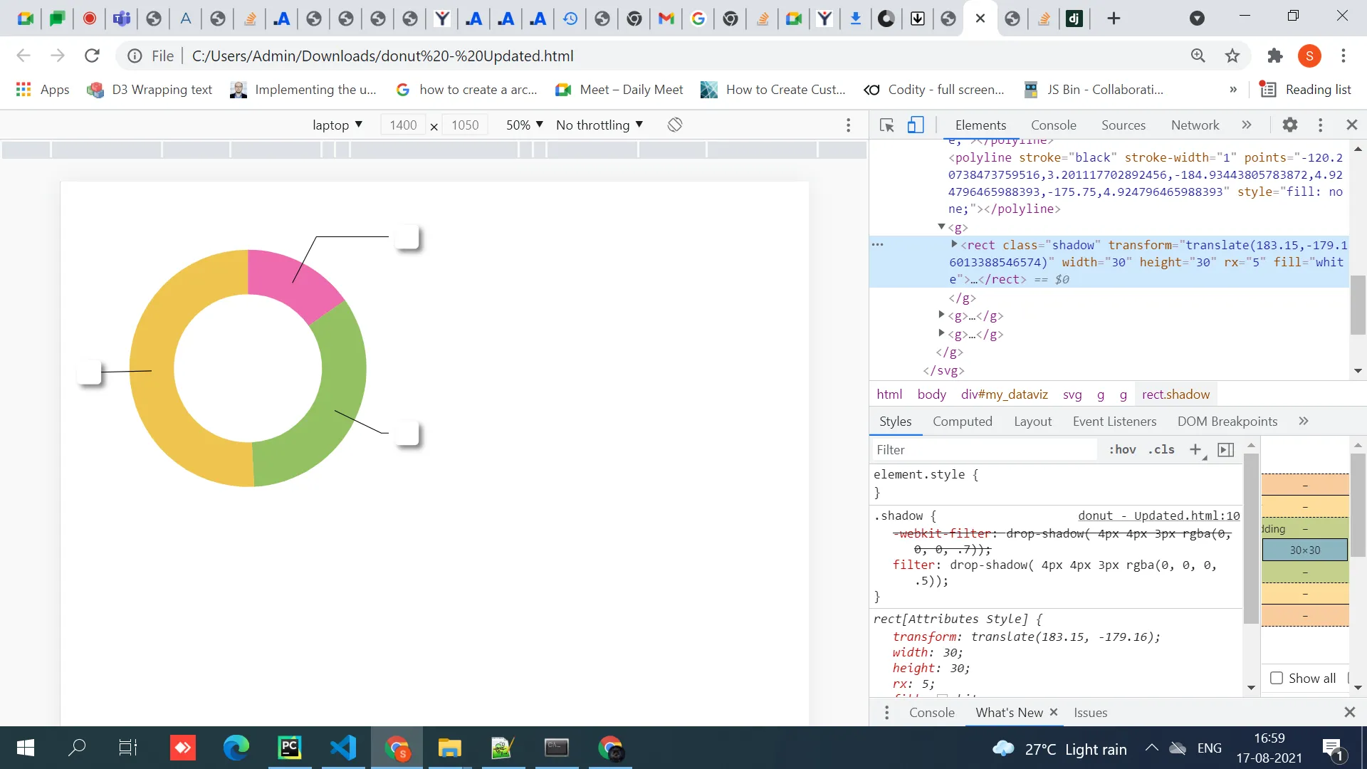
当前输出
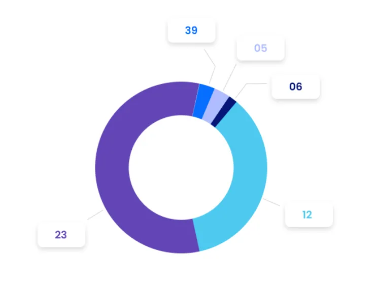
期望结果
任何帮助或指导都将是极大的帮助
text-anchor: middle和alignment-baseline: middle。 - Michael Rovinsky