正在制作Google折线图。我遇到的问题是图表只显示一天的值,没有实现带日期的时间线。我明白如果您从例如一周中获取值,则图表会很宽,有没有什么办法解决这个问题?我想到了这样的方法:
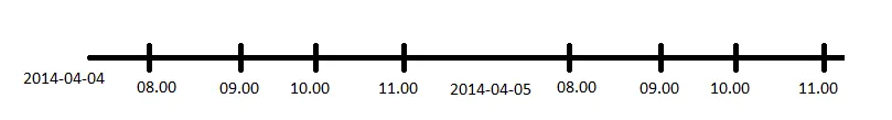
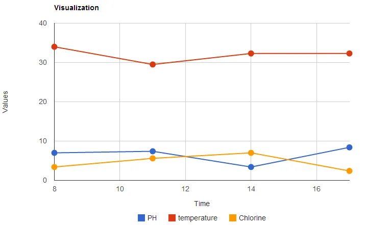
目前的外观:
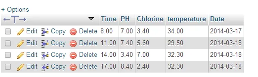
数据库:(日期保存为phpadmin中的日期)
代码:
<?php

$con=mysql_connect("localhost","root","") or die("Failed to connect with database!!!!");
mysql_select_db("chart", $con);

$sth = mysql_query("SELECT * FROM googlechart");

$rows = array();
//flag is not needed
$flag = true;
$table = array();
$table['cols'] = array(

 // Labels for your chart, these represent the column titles
    // Note that one column is in "string" format and another one is in "number" format as pie chart only required "numbers" for calculating percentage and string will be used for column title
    array('label' => 'Time',    'type' => 'number'),
    array('label' => 'PH',      'type' => 'number'),
    array('label' => 'temperature','type' => 'number'),
    array('label' => 'Chlorine','type' => 'number'),

    );

    $rows = array();

while($r = mysql_fetch_assoc($sth)) {
     $temp = array();
        $temp[] = array('v' => (string) $r['Time']);
        $temp[] = array('v' => (string) $r['PH']);
        $temp[] = array('v' => (string) $r['temperature']);
        $temp[] = array('v' => (string) $r['Chlorine']);


        $temp[] = array('v' => (int) $r['Time']);
        $rows[] = array('c' => $temp);

}

 $table['rows'] = $rows;
 $jsonTable = json_encode($table);
 echo $jsonTable;

?>


<html>
  <head>

    <script type="text/javascript" src="https://www.google.com/jsapi"></script>
    <script type="text/javascript">
      google.load("visualization", "1", {packages:["corechart"]});
      google.setOnLoadCallback(drawChart);

      function drawChart() {
        var data = new google.visualization.DataTable(<?=$jsonTable?>);

        var options = {
        /*width: 900, height: 900, */
          title: 'Visualization',
          /* curveType: 'function', */
           legend: { position: 'bottom' },
           pointSize: 10,
        vAxis: {title: "Values", titleTextStyle: {italic: false}},
        hAxis: {title: "Time", titleTextStyle: {italic: false}},
        };

        var chart = new google.visualization.LineChart(document.getElementById('chart_div'));
        chart.draw(data, options);


      }
    </script>
  </head>
  <body>
    <div id="chart_div" style="width: 900px; height: 500px;"></div>
  </body>
</html>