我使用了CSS的弹性盒布局,如下所示:
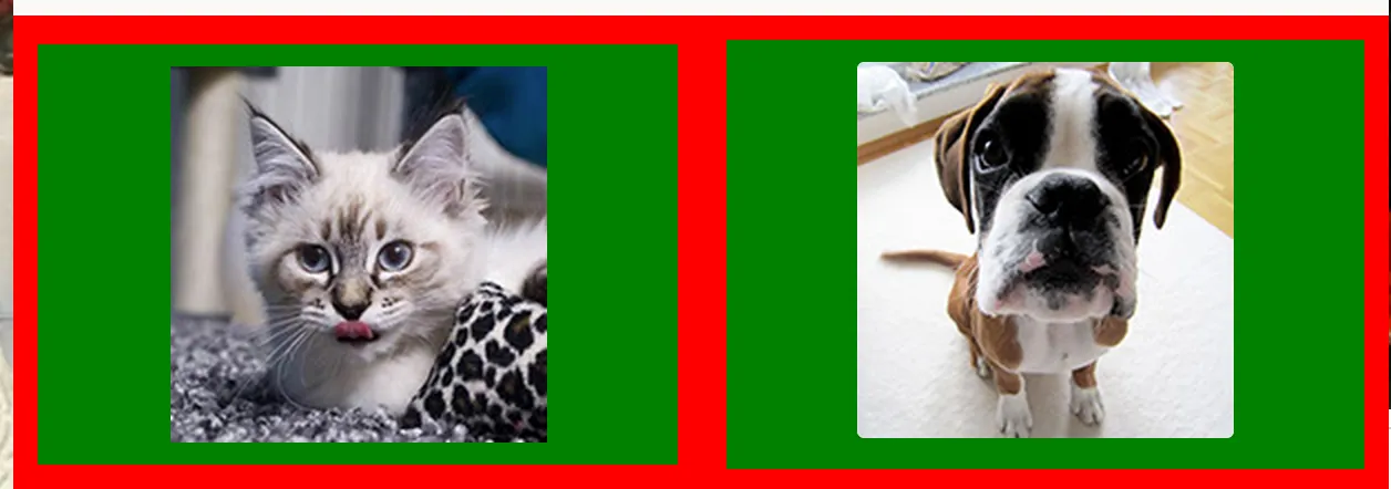
如果屏幕变小,它会变成这样:
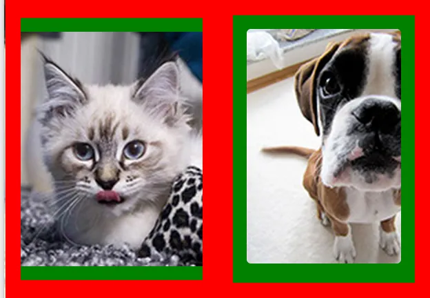
问题是图像没有按原始图像的纵横比重新调整大小。
是否可能使用纯CSS和弹性盒布局使图像在屏幕变小时自适应调整大小?
以下是我的HTML代码:
<div class="content">
  <div class="row">
    <div class="cell">
      <img src="http://i.imgur.com/OUla6mK.jpg"/>
    </div>
    <div class="cell">
      <img src="http://i.imgur.com/M16WzMd.jpg"/>
    </div>
  </div>
</div>
我的 CSS:
.content {
    background-color: yellow;
}

.row {
    display: -webkit-box;
    display: -moz-box;
    display: -ms-flexbox;
    display: -webkit-flex;
    display: flex;

    -webkit-box-orient: horizontal;
    -moz-box-orient: horizontal;
    box-orient: horizontal;
    flex-direction: row;

    -webkit-box-pack: center;
    -moz-box-pack: center;
    box-pack: center;
    justify-content: center;

    -webkit-box-align: center;
    -moz-box-align: center;
    box-align: center;
    align-items: center;

    background-color: red;

}

.cell {
    -webkit-box-flex: 1;
    -moz-box-flex: 1;
    box-flex: 1;
    -webkit-flex: 1 1 auto;
    flex: 1 1 auto;

    padding: 10px;
    margin: 10px;

    background-color: green;
    border: 1px solid red;
    text-align: center;

}
img的 CSS 中添加height:100%;。 - Omegaheight: 100vh即可,不要使用height: 100%。高度的样式总是很棘手。 - gdbj