我的 df:
> head(merged)
        Date patch     prod workmix_pct jobcounts travel FWIHweeklyAvg              month year
1 2013-03-29  BVG1 2.932208         100      9480   30.7      1.627024              March 2013
2 2013-03-29 BVG11 2.769156          10       968   34.3      4.475714              March 2013
3 2013-03-29 BVG12 2.857344          16      1551   33.8      3.098571              March 2013
4 2013-03-29 BVG13 2.870111          13      1267   29.1      1.361429              March 2013
5 2013-03-29 BVG14 3.011260          17      1625   28.1      1.550000              March 2013
6 2013-03-29 BVG15 3.236246          21      1946   24.9      1.392857              March 2013
我正在尝试绘制prod列的年度对比图。 我有从2013年3月到2015年3月的数据。
这是我尝试过的:
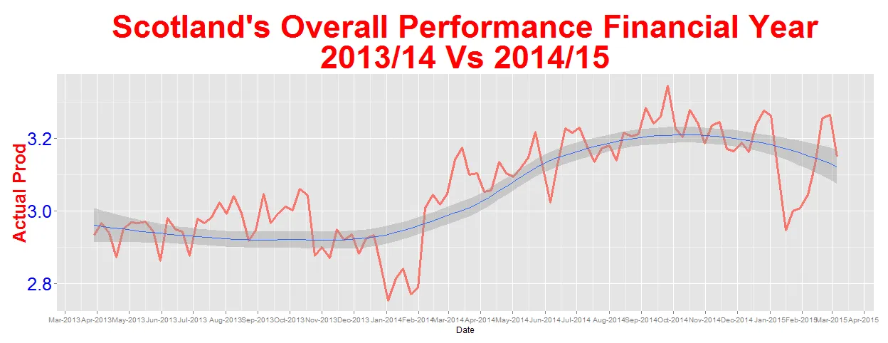
ggplot(data=merged,aes(Date, prod)) + #dataframe
  geom_line(data=merged[merged$patch %in% c("BVG1"),],aes(y=prod, colour="red"),lwd = 1.3,)+ #select BVG1
  geom_smooth() +
        scale_x_date(labels = date_format("%b-%Y"),breaks = "1 month") + #how many breaks and Date format
        ylab("Actual Prod") +
        ggtitle("Scotland's Overall Performance Financial Year\n2013/14 Vs 2014/15") +
        theme(axis.title.y = element_text(size = 25, vjust=0.3,face = "bold",color = "red"),
        axis.text.y=element_text(size=25, color="blue"),
        plot.title = element_text(lineheight = .8,face = "bold",color = "red",size = 45, vjust = 1),
        legend.text = element_text(size=35))+ theme(legend.position="none")
这给了我这个图:
现在我想绘制2013年与2014年的比较,然后是2014年与2015年的比较。最后是2013年与2015年的比较。
这是我尝试过的:
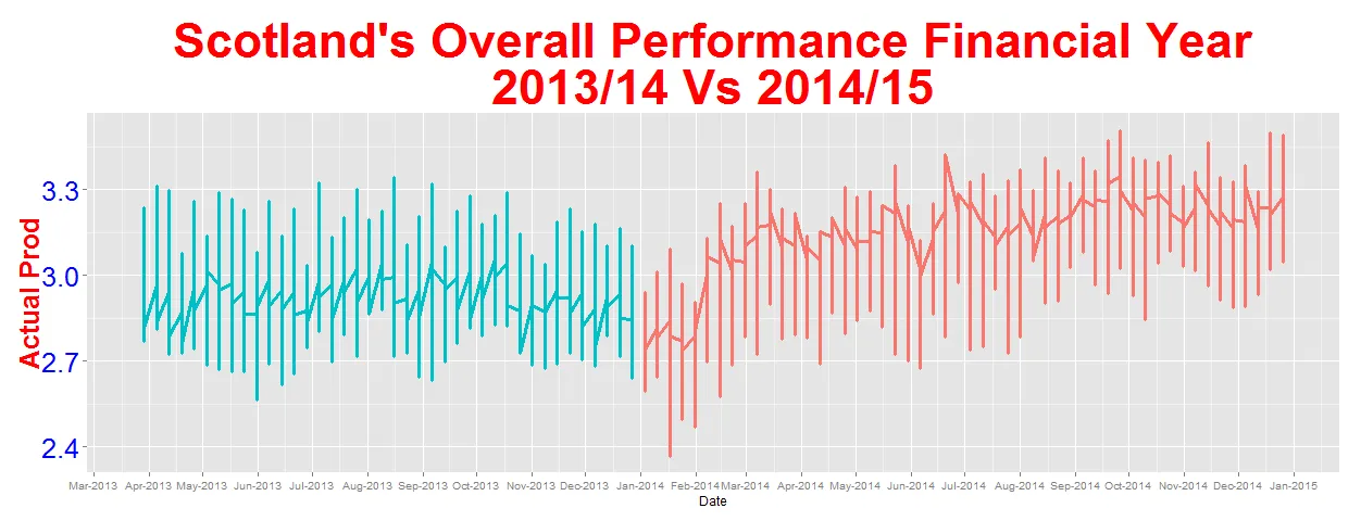
ggplot(data=merged,aes(Date)) + #dataframe
  geom_line(data=merged[merged$year==2013,],aes(y=prod, colour="red"),lwd = 1.3,)+ #select 2013
  geom_line(data=merged[merged$year==2014,],aes(y=prod, colour="blue"),lwd = 1.3,)+ #select 2014
        scale_x_date(labels = date_format("%b-%Y"),breaks = "1 month") + #how many breaks and Date format
        ylab("Actual Prod") +
        ggtitle("Scotland's Overall Performance Financial Year\n2013/14 Vs 2014/15") +
        theme(axis.title.y = element_text(size = 25, vjust=0.3,face = "bold",color = "red"),
        axis.text.y=element_text(size=25, color="blue"),
        plot.title = element_text(lineheight = .8,face = "bold",color = "red",size = 45, vjust = 1),
        legend.text = element_text(size=35))+ theme(legend.position="none")
这是我收到的:
 。
。希望能有以下内容:
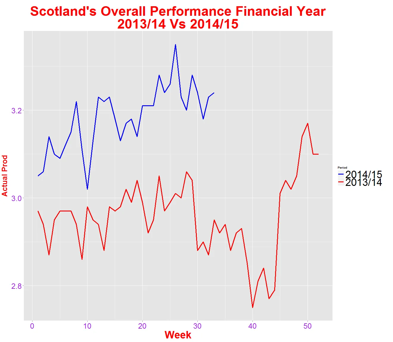 。
。还有:
 ,
但不是以“周”为视图,而是以“月”为视图。
,
但不是以“周”为视图,而是以“月”为视图。任何帮助或想法都将不胜感激。
非常感谢。
更新:
根据Ruthger Righart的回答,我进行了以下操作:
library(dplyr)
mergedYearonYearProdMeans = merged %>%
group_by(year,month) %>%
mutate(MonthlyAve = mean(prod))
ordered.months <- factor(mergedYearonYearProdMeans$month, as.character(mergedYearonYearProdMeans$month))
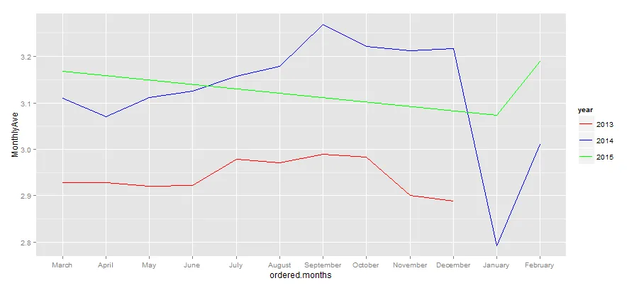
ggplot(data=mergedYearonYearProdMeans,aes(ordered.months,MonthlyAve,group=year,shape=year,color=year)) + #dataframe
geom_line()+
scale_color_manual(values = c("red","blue","green"))
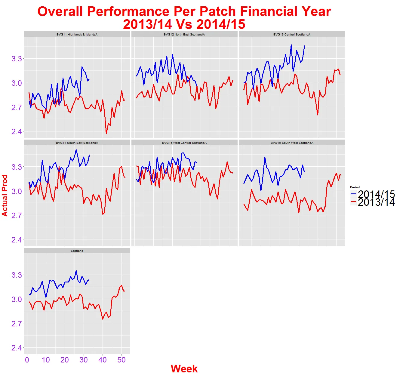
我的图表没有从2015年1月开始。产品只在1月、2月和3月显示,其他月份不应该显示平坦的绿线,如下所示。