是否可以使用CSS3制作曲线/弧形菜单?
我能否使用canvas或HTML5中的其他东西来实现这个效果?
提前感谢,Logan
<div class="container">
    <div class="gray"></div>
    <div class="white"></div>
</div>
样式表
.container {
    height: 200px;
    overflow: hidden;
    position: relative;
}
.gray,
.white {
    position: absolute;
    left: -25%;
    right: -25%;
    border-radius: 100%;
}
.gray { /* use a gray border with border radius to emulate an arc */
    top: -50%;
    border:100px solid gray;
    border-top: none;
    height: 200px;
}
.white { /* put a white oval on top for the top edge of the banner */
    top: -80%;
    background-color: white;
    height: 300px;
}
现在的挑战是定位所有菜单项并相应旋转...
我并不认为这是可行的解决方案,但我还是发布了希望你可能会发现它有用。
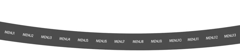
这是我用SVG做的一个版本,它是一个概念验证,需要调整才能看起来好(在Chrome中渲染效果很差,在IE中很小),但它给出了基本想法:
svg
<svg viewBox="0 0 500 300" version="1.1">
    <defs>
        <!-- Start at (10,40) end at (490,40) use control point (250 ,85) -->
        <path id="curvetext" d="M 10,40 Q 250,85 490,40" />
    </defs>
    <use x="0" y="0" xlink:href="#curvetext" fill="none" stroke="gray" stroke-width="50"/>
    <text font-size="12" fill="white">
        <textPath xlink:href="#curvetext">
            <a xlink:href="http://example.com">Menu 1</a> Menu 2 Menu 3 Menu 4 Menu 5 Menu 6 Menu 7 Menu 8 Menu 9
        </textPath>
    </text>
</svg>
SVG演示在:http://jsfiddle.net/rNLsr/2/