如何在Bootstrap 4中去除轮廓线

56

我想要去除bootstrap 4中的文本框轮廓线,但无法成功。如何去掉这条线?
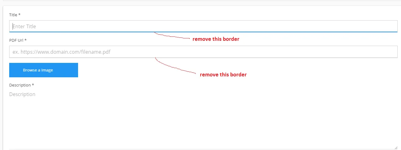
enter image description here

CSS

#content #main-content input[type=text]{
   border: 0;
   border: 1px solid #ccc;
   height: 40px;
   padding-left: 10px;
   outline: 0;
 }

HTML

<div class="form-group">
   <label for="title">Title <span>*</span></label>
   <input type="text" class="form-control" id="title" name="title" placeholder="Enter Title">
</div>

据我所知,这在bootstrap4中不存在......请分享工作的fiddle或codepen链接... - Bhuwan
我已经从https://bootswatch.com/materia/下载了自定义CSS。 - Sandeep
看起来你正在使用一个主题。你必须覆盖那个主题。这意味着你必须编写 CSS 规则,要么应用于后面,具有与主题相同的选择器,要么为你想要更改的属性编写比主题更强的选择器的 CSS 规则。没有 [mcve],没有人能帮助你。 - tao
不确定这是否仍然相关,但我遇到了与Bootstrap 4.5中单击汉堡菜单时删除按钮边框的相同问题...尝试了这里描述的所有内容,调整变量等等...但是我通过在我的自定义CSS中设置以下内容(在加载Bootstrap之后)来完成工作-> button:focus {outline: 0px none; outline: 0px auto -webkit-focus-ring-color;} - Timothy
我只是简单地将这两个属性设置为none border: none; box-shadow: none; - Dadu Laal
14个回答

125

您可以添加shadow-none Bootstrap类来移除焦点轮廓:

<div class="form-label-group">
  <input type="password" id="inputPassword" class="form-control shadow-none" placeholder="Password" required>
  <label for="inputPassword">Password</label>
</div>

2
简单解决方案在2019年依然有效 :) 我用它来创建Bootstrap 4下拉菜单中的按钮。 - Greg Holst
这是一个非常优雅的解决方案,也适用于按钮。为什么这不是被接受的答案呢? - Matthew
1
不是很喜欢跟风,但这个很好用。以前从未知道这个类存在。像这样的小技巧我会与我的学生分享 :) - Woody
很高兴听到这个消息,@Woody。我之前也不知道它的存在,直到有一天我意识到必须有更好的方法,于是我开始深入研究Bootstrap源代码。可惜它的文档记录不够详细。 - John Dibling
2
在 Bootstrap 5,2022 年版中对我管用。 - M Katz
3
它是Bootstrap 5,而且运行得非常好 :) - ndotie

49

你正在使用的主题在focus时将box-shadow设置为inset 0 -2px 0 #2196F3

你需要覆盖它,但不要用none,因为那只会将其删除。你可能希望保持其与未聚焦时相同的值。简而言之,你需要这样做:

textarea:focus, 
textarea.form-control:focus, 
input.form-control:focus, 
input[type=text]:focus, 
input[type=password]:focus, 
input[type=email]:focus, 
input[type=number]:focus, 
[type=text].form-control:focus, 
[type=password].form-control:focus, 
[type=email].form-control:focus, 
[type=tel].form-control:focus, 
[contenteditable].form-control:focus {
  box-shadow: inset 0 -1px 0 #ddd;
}

请注意,您需要在加载Bootstrap CSS和您正在加载的主题之后加载此CSS文件。


28

虽然接受的答案可行,但它并不是最佳选择。您可以通过编辑变量来简单地覆盖输入/按钮轮廓。 (由于问题特别要求Bootstrap 4)

如果您覆盖了Bootstrap 4变量 如此。 您可以使用以下代码禁用所有焦点轮廓:

$input-btn-focus-box-shadow: none;
$input-btn-focus-width: 0;

只需禁用按钮的焦点轮廓,使用以下代码:

只有禁用按钮聚焦轮廓时使用以下代码:

$btn-focus-box-shadow: none;

这也可以用于指标、选择、下拉列表等。只需搜索Bootstrap 4的默认变量列表


编辑

对于v5也适用:Github变量

即使您可以禁用焦点轮廓,但这并不是最佳实践。根据网络辅助功能键盘标准,一个网站应该能够使用制表符。通过禁用CSS,您将禁用此功能。

为了分离这些用户,有一个新的伪类::focus-visible,你可以使用,但它还不兼容所有浏览器。 Chromium更改日志


3
谢谢。第一个方法适用于输入框,但不适用于按钮。对于按钮,我找到了$input-btn-focus-width变量,应该将其设置为0。万一有人看到这个答案。 - soeik
1
@soeik,你的评论救了我的命! - MeeDNite

4

您需要在input:focus上删除box-shadow

请在Bootstrap CSS下面的自定义CSS文件中编写此CSS以进行覆盖。如果您使用自定义父类,这将是一个很好的实践。

.parent-class .form-group input[type=text]:focus,
.parent-class .form-group [type=text].form-control:focus, {
  box-shadow: none;
}

4
这更好,也更短:
input[type="text"], textarea {
              outline: none;
              box-shadow:none !important;
              border:1px solid #ccc !important;
                                                 }

2
一个非常简单的解决方案如下:
form .form-control:focus{
  border-color: #0d6efd;
  box-shadow: none;
}

我们覆盖了.bootstrap类的.form-control。 我也面临同样的问题,我用这个技巧解决了它,这样我们就不必考虑在引入bootstrap之后导入CSS之类的事情。 注意:#0d6efd是我想要给我的输入元素聚焦时的颜色。


2

使用box-shadow无法完全隐藏按钮的轮廓,并且它不适用于输入、文本框和其他表单控件... 使用shadow-none会有一条细小的边框,但比前面的解决方案好得多...如果需要帮助,以下是代码:

<link href="https://cdn.jsdelivr.net/npm/bootstrap@5.0.2/dist/css/bootstrap.min.css" rel="stylesheet" integrity="sha384-EVSTQN3/azprG1Anm3QDgpJLIm9Nao0Yz1ztcQTwFspd3yD65VohhpuuCOmLASjC" crossorigin="anonymous">
<form action="/search" method="get">
  <center class="container">
    <div class="input-group mb-3">

      <input type="text" class="form-control shadow-none" placeholder="Search the web" aria-label="Username" aria-describedby="basic-addon1" required name="q" autocomplete="off">
      <input type="submit" class="btn input-group-text shadow-none" id="basic-addon1" value="search">
    </div>
  </center>
</form>
<script src="https://cdn.jsdelivr.net/npm/bootstrap@5.0.2/dist/js/bootstrap.bundle.min.js"></script>


1
以下代码刚刚在我的电脑上运行成功了,我真心希望它也能帮助到其他人。
.form-group input:focus{
     outline:0px !important; 
     box-shadow: none !important;
  }


0

你只需要在 CSS 的焦点事件中添加 box-shadow: none 例如:

.box_style:focus{
       border:none;
       box-shadow:none;
   }

0

在任何CSS代码中尝试使用!important属性。这不会覆盖其他CSS。 试试这个:

//for normal text box
input[type=text]{
   border: 0 !important;
   height: 40px;
   padding-left: 10px;
   outline: 0 !important;
}
//for selected/active text box
input[type=text]:focus{
   border: 0 !important;
   outline: 0 !important;
}
//for hovered text box
input[type=text]:hover{
   border: 0 !important;
   outline: 0 !important;
}

网页内容由stack overflow 提供, 点击上面的
可以查看英文原文,
原文链接