背景图片模糊 - CSS

3

亲爱的开发者们,

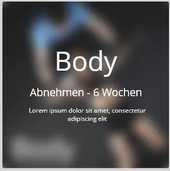
我想要在鼠标悬停时模糊背景图片,但并没有成功。有谁能帮帮我吗?我尝试了很多种方法。 这是一个框,我想要通过hover-over效果来模糊背景并显示文本。 当前当鼠标悬停在方框上时,会出现以下两种情况: 要么: 背景变模糊了,但文本没有出现 或者: 文本出现了,但背景没有模糊

enter image description here

HTML

<div class="kursContainer">
        <div class="BodyKurs">
                <h1>Body</h1>
                <picture>
                    <img src="../Kurse/img/body.webp" alt="zumba">
                </picture>
            <div class="overlay">
                <h2>Body</h2>
                <h3>Abnehmen - 6 Wochen</h3>
                <h4>Lorem ipsum dolor sit amet, consectetur adipiscing     elit</h4>
            </div>
        </div>

CSS

.kursContainer {
  display: grid;
  justify-content: space-evenly;
  grid-template-columns: repeat(3, 1fr);
  grid-gap: 1em;
  justify-items: center;
  width: 122vmin;
  margin: 2vmin auto;
  align-items: center;

  grid-template-areas:
    "body body fatburn"
    "body body zumba"
    "yoga sixpack sixpack"
    "step sixpack sixpack"
    "backwork backwork tourde"
    "backwork backwork booty";
 }
 .BodyKurs{
   position: relative;
   width: 80vmin;
   height: 80vmin;
   border-radius: 10px;
   background-color: var(--schwarz);
   transition: transform 0.2s;
 }

.BodyKurs img{
   width: 80vmin;
   border-radius: 10px;
}
 .BodyKurs h1 {
   position: absolute;
   text-align: start;
   padding-left: 3vmin;
   bottom: 1vmin;
   color: var(--hellGrau);
   font-size: 8vmin;
 }

 .BodyKurs:hover {
    box-shadow: 0 0px 4.6px rgba(0, 0, 0, 0.278),
     0 0px 15.4px rgba(0, 0, 0, 0.411), 0 0px 69px rgba(0, 0, 0, 0.69);
   transform: scale(1.05);
   z-index: 2;
   cursor: pointer;
 }

  .overlay {
  width: 80vmin;
  height: 80vmin;
  position: absolute;
  text-align: center;
  bottom: 0;
  border-radius: 10px;
  color: var(--hellGrau);
  transition: 0.3s all;
  /* background: rgba(0, 0, 0, 0.2); */
  visibility: hidden;
   cursor: pointer;
  z-index: 5;
}
 .overlay:hover {
  visibility: visible;
}

picture:hover {
  filter: blur(5px);
}

这个回答解决了你的问题吗?如何将CSS滤镜应用于背景图像 - Yash Chitroda
3个回答

1
使用CSS中的filter: blur():hover:before伪类上,并将其应用于img标签。我在文本内容上使用了一个p标签,并在两个元素上设置了z-index。有效地将元素叠放在一起。
背景将放在:before上,确保将位置设置为绝对位置,并将内容设置为''(空)。高度和宽度都设置为100%,以便填充它所堆叠的div。 blur() filter:

.image {
  height: 200px;
  width: 200px;
  display: flex;
  justify-content: center;
}
.image:before {
  content: '';
  position: absolute;
  height: 100%;
  width: 100%;
  top: 0;
  left: 0;
  background-image: url(https://image.shutterstock.com/image-photo/white-transparent-leaf-on-mirror-260nw-1029171697.jpg);
  z-index: -1;
}
.image:hover:before {
  -webkit-filter: blur(20px);
  filter: blur(20px);
}
.img {
  position: relative;
  width: 200px;
  height: 200px;
}
.image p {
  z-index: 9999999;
}
<div class="img">
  <div class="image">
    <p>Some dummy text here</p>
  </div>
</div>


1
您可以使用:not(:hover)样式。

示例1:

.wrap:hover img,
.wrap:hover img:not(:hover) {
    filter: blur(3px);
}

.wrap {
    width: 300px;
}

span {
    position: absolute;
    color: #ffffff;
    z-index: 1;
    text-align: center;
    width: 300px;
    display: none;
}

.wrap:hover span {
    display: block;
}
<div class='wrap'>
    <span>
        <h1>Lorem</h1>
        <p>Text</p>
    </span>
    <img src="https://encrypted-tbn0.gstatic.com/images?q=tbn%3AANd9GcRK7bvAryKdY7JSlepTHatE1A4nAVU5lJXkdw&usqp=CAU"
        width="300px">
</div>


这个示例涉及一些CSS,但我认为它更容易理解。再次使用:not(:hover),但这次是在span元素上。

示例2:

.wrap:hover img,
.wrap:hover span:not(:hover) {
    filter: blur(3px);
}

.wrap {
    position: relative;
    width: 300px;
    overflow: hidden;
}

span {
    position: absolute;
    top: 0px;
    right: 0px;
    bottom: 0px;
    left: 0px;
    color: #ffffff;
    z-index: 1;
    text-align: center;
    display: none;
}

.wrap:hover span {
    display: block;
}
<div class='wrap'>
    <span>
        <h1>Lorem</h1>
        <p>Text</p>
    </span>
    <img src="https://encrypted-tbn0.gstatic.com/images?q=tbn%3AANd9GcRK7bvAryKdY7JSlepTHatE1A4nAVU5lJXkdw&usqp=CAU"
        width="300px">
</div>


1
我很高兴能够帮到您! :) 感谢您接受了我的答案,如果您愿意,可以给我的答案一个积极的评价。 - 54ka

0

尝试从body中删除图片标签,仅使用CSS背景图像属性。在悬停时将覆盖层的背景颜色设置为下面显示的rgba单位:

<div class="kursContainer">
        <div class="BodyKurs">
                <h1>Body</h1>
            <div class="overlay">
                <h2>Body</h2>
                <h3>Abnehmen - 6 Wochen</h3>
                <h4>Lorem ipsum dolor sit amet, consectetur adipiscing     elit</h4>
            </div>
        </div>
</div>

CSS

.kursContainer {
  display: grid;
  justify-content: space-evenly;
  grid-template-columns: repeat(3, 1fr);
  grid-gap: 1em;
  justify-items: center;
  width: 122vmin;
  margin: 2vmin auto;
  align-items: center;

  grid-template-areas:
    "body body fatburn"
    "body body zumba"
    "yoga sixpack sixpack"
    "step sixpack sixpack"
    "backwork backwork tourde"
    "backwork backwork booty";
 }
 .BodyKurs{
   position: relative;
   width: 80vmin;
   height: 80vmin;
   border-radius: 10px;
   background-color: var(--schwarz);
   transition: transform 0.2s;
   background-image: url("../Kurse/img/body.webp");
 }

.BodyKurs img{
   width: 80vmin;
   border-radius: 10px;
}
 .BodyKurs h1 {
   position: absolute;
   text-align: start;
   padding-left: 3vmin;
   bottom: 1vmin;
   color: var(--hellGrau);
   font-size: 8vmin;
 }

 .BodyKurs:hover {
    box-shadow: 0 0px 4.6px rgba(0, 0, 0, 0.278),
     0 0px 15.4px rgba(0, 0, 0, 0.411), 0 0px 69px rgba(0, 0, 0, 0.69);
   transform: scale(1.05);
   z-index: 2;
   cursor: pointer;
 }

  .overlay {
  width: 80vmin;
  height: 80vmin;
  position: absolute;
  text-align: center;
  bottom: 0;
  border-radius: 10px;
  color: var(--hellGrau);
  transition: 0.3s all;
  /* background: rgba(255, 255, 255, 0.3); */
   cursor: pointer;
  z-index: 5;
}
 .overlay:hover {
  background-color: rgba(255, 255, 255, 0.5);
}

picture:hover {
  filter: blur(5px);
}

非常感谢,但对我来说没有起作用。我不知道为什么。 - Sasan R.Nami

网页内容由stack overflow 提供, 点击上面的
可以查看英文原文,
原文链接