ggplot在单元格之间绘制瓷砖线

12

我正在使用ggplot和geom_tile制作热图。我希望在单元格之间插入一些淡线。

例如:

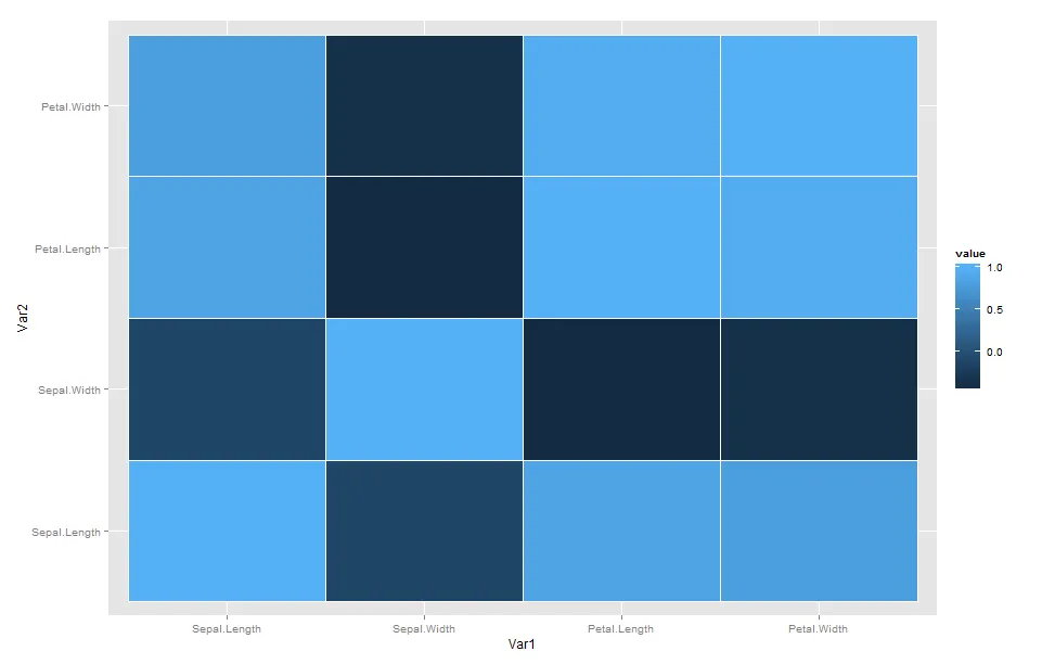
我的ggplot geom_tile 热图:

library(ggplot2)
library(reshape2)
data("iris")
x = melt(cor(iris[,1:4]))
ggplot(data=x,aes(Var1,Var2,fill=value)) + geom_tile() # No line between the cells

我想要什么(来自R中的d3heatmap包)

library(d3heatmap)
data("iris")
x = cor(iris[,1:4])
d3heatmap(cor(iris[,1:4]),Rowv = F,Colv = F) #There is a faint line between the cells

(很抱歉无法发布任何图片)感谢!

1个回答

20

只需将color = "gray"添加到您的geom_tile中即可

library(ggplot2)
library(reshape2)
data("iris")
x = melt(cor(iris[,1:4]))
ggplot(data=x,aes(Var1,Var2,fill=value)) + 
  geom_tile(color = "gray")

会给您这个带有瓷砖间连线的图形:enter image description here

您可以通过调整 size 来使线条变粗或变细,并/或者使用 color = white


嗨!谢谢分享。我想知道是否有任何方法可以将特定单元格设置为某种颜色?比如我想让Sepal.Length和Sepal.width变成“红色”。 - jimmy15923
@jimmy15923 设置数据,而不是单元格。或者将其作为一个新问题提出。 - RHA

网页内容由stack overflow 提供, 点击上面的
可以查看英文原文,
原文链接