我有一个SVG文件,想将其制作成SvgIcon组件,应该怎么做?
在这个文档中,所有的例子都使用预定义的Material Icons或一个奇怪的符号
在这个文档中,所有的例子都使用预定义的Material Icons或一个奇怪的符号
<path d="M10 20v-6h4v6h5v-8h3L12 3 2 12h3v8z" />,我不知道它是什么。<path d="M10 20v-6h4v6h5v-8h3L12 3 2 12h3v8z" />,我不知道它是什么。<Icon/> 组件和 <img/> 元素为了使用 SVG 文件作为图标,我使用了 <Icon/> 组件和一个嵌套的 <img/> 元素,将 height: 100% 应用于 img 元素,将 textAlign: center 应用于 <Icon/> 组件的 root 类即可:
JSX:
import Icon from '@material-ui/core/Icon';
import { makeStyles } from '@material-ui/styles';
...

<Icon classes={{root: classes.iconRoot}}>
  <img className={classes.imageIcon} src="/graphics/firebase-logo.svg"/>
</Icon>
样式:
const useStyles = makeStyles({
  imageIcon: {
    height: '100%'
  },
  iconRoot: {
    textAlign: 'center'
  }
});
结果:

更新
如评论中Lorenz Haase所述,SVG底部略微被裁剪,如果我们使用flexbox和继承宽度和高度,可以解决此问题:
const useStyles = makeStyles({
  imageIcon: {
    display: 'flex',
    height: 'inherit',
    width: 'inherit'
  }
});
<SvgIcon/> 组件和@svgr/webpack webpack 加载器根据MUI 官方文档,我们可以使用<SvgIcon/>组件属性并且使用@svgr/webpack加载器通过 ESM 导入.svg文件。
组件属性
即使您的图标以
.svg格式保存,也可以使用SvgIcon包装器。 svgr有加载器来导入SVG文件并将其用作React组件。例如,使用webpack:
// webpack.config.js
{
  test: /\.svg$/,
  use: ['@svgr/webpack'],
}

// ---
import StarIcon from './star.svg';

<SvgIcon component={StarIcon} viewBox="0 0 600 476.6" />
也可以与"url-loader"或"file-loader"一起使用。这是Create React App所采用的方法。
// webpack.config.js
{
  test: /\.svg$/,
  use: ['@svgr/webpack', 'url-loader'],
}

// ---
import { ReactComponent as StarIcon } from './star.svg';

<SvgIcon component={StarIcon} viewBox="0 0 600 476.6" />
<path /> 是SVG路径,即SVG的内部位。 SvgIcon 组件本应该能够接受路径,但它并没有这个功能 :(
相反,您可以创建一个类似于https://github.com/callemall/material-ui/blob/56c113217d7d05d8bb0712771b727df81984d04b/src/svg-icons/action/home.js的组件,并将其中的svg源代码替换为自己的路径。(我建议使用https://jakearchibald.github.io/svgomg/进行一些缩小处理)
<SvgIcon>中使用它们:import React from "react";
import { ReactComponent as Logo } from "./logo.svg";
import SvgIcon from "@material-ui/core/SvgIcon";
const App = () => (
<SvgIcon>
<Logo />
</SvgIcon>
);
export default App;
另请参阅:https://create-react-app.dev/docs/adding-images-fonts-and-files/#adding-svgs
不幸的是,React似乎尚不能渲染所有类型的SVG(例如,使用Inkscape、Illustrator修改后的SVG)。但至少在create-react-app项目中,默认的logo.svg是可用的。
要获取SvgIcon的路径,请使用文本编辑器打开svg文件并复制相应的路径表达式。
安装 vite-plugin-svgr 插件。
npm i -D vite-plugin-svgr
vite.config.ts 文件中:import svgr from 'vite-plugin-svgr'
export default {
// ...
plugins: [svgr()],
}
src/vite-env.d.ts 中添加一个声明。/// <reference types="vite-plugin-svgr/client" />
import { ReactComponent as Logo } from './logo.svg'
// ...
<SvgIcon component={Logo} inheritViewBox />
SvgIcon 不适用于此目的。更多信息请查看 Github。
你可能在寻找这个: startIcon={<img src={google}></img>}
import google from "../../Assets/img/google.svg";
import GitHubIcon from "@material-ui/icons/GitHub";
const useStyles = makeStyles((theme) => ({
root: {
display: "flex",
flexDirection: "column",
margin: theme.spacing(1),
},
button: {
margin: "0.5rem",
},
googleStyle: {
fillColor: theme.palette.primary.main,
},
}));
export default function ContainedButtons() {
const classes = useStyles();
return (
<div>
<Button
variant="contained"
color="secondary"
className={classes.button}
startIcon={<img src={google}></img>}
>
Login With Google
</Button>
<Button
variant="contained"
color="secondary"
className={classes.button}
startIcon={<GitHubIcon />}
>
Login with GitHub
</Button>
</div>
);
}
import React from 'react';
import pure from 'recompose/pure';
import {SvgIcon} from '@material-ui/core';
let smile = (props) => (
<SvgIcon {...props} >
<path d="M256,32C132.281,32,32,132.281,32,256s100.281,224,224,224s224-100.281,224-224S379.719,32,256,32z M256,448
c-105.875,0-192-86.125-192-192S150.125,64,256,64s192,86.125,192,192S361.875,448,256,448z M160,192c0-26.5,14.313-48,32-48
s32,21.5,32,48c0,26.531-14.313,48-32,48S160,218.531,160,192z M288,192c0-26.5,14.313-48,32-48s32,21.5,32,48
c0,26.531-14.313,48-32,48S288,218.531,288,192z M384,288c-16.594,56.875-68.75,96-128,96c-59.266,0-111.406-39.125-128-96"/>
</SvgIcon>
);
smile = pure(smile);
smile.displayName = 'smile';
smile.muiName = 'SvgIcon';
export default smile;
const wrapSvgPath = (path, viewBox='0 0 24 24') => (props) => (
<SvgIcon {...props} viewBox={viewBox}>{path}</SvgIcon>
)
用法如下:
const facebookPath = (<path
d="M17,2V2H17V6H15C14.31,6 14,6.81 14,7.5V10H14L17,10V14H14V22H10V14H7V10H10V6A4,4 0 0,1 14,2H17Z" />
)
export const FacebookIcon = wrapSvgPath(facebookPath)
除了Christos的答案之外,确保viewBox被设置为mui给出的svg元素的尺寸,否则可能会裁剪对象。
例如,当尝试将Discord的一个svg放入IconButton中时,我遇到了以下问题:
<svg width="71" height="55"...
但是在正确设置viewBox之前,只能看到图标的左上角。设置后:
<SvgIcon component={DiscordIcon} viewBox="0 0 71 55" />
那样就意味着所有东西都是可见的,并且调整 IconButton 的大小也可以按预期进行。
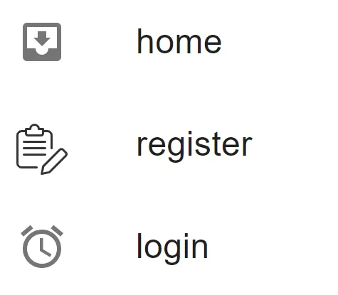
import SvgIcon from '@material-ui/core/SvgIcon'
import Register from "./../../media/register.svg"
import React from 'react';
const getSvgIconMaterial = (Icon: string, props?: any) => {
return (
<SvgIcon component="object">
<embed type="image/svg+xml" src={Icon} style={{ height: "100%" }} />
</SvgIcon>
);
};
use like this
<>{getSvgIconMaterial(Register)}</>
可能不完美但表现得很好。也许可以加上小的padding/margin。
  imageIcon: {
    display: 'flex',
    height: 'inherit',
    width: 'inherit',
  }
});```

图像不会被裁剪。
根样式不再必要,图像从父 Icon 组件获取其尺寸。
- Lorenz Haase