多类别分类中的ROC

42

我正在进行不同的文本分类实验。现在,我需要为每个任务计算AUC-ROC。对于二元分类,我已经使用以下代码使其工作:

scaler = StandardScaler(with_mean=False)

enc = LabelEncoder()
y = enc.fit_transform(labels)

feat_sel = SelectKBest(mutual_info_classif, k=200)

clf = linear_model.LogisticRegression()

pipe = Pipeline([('vectorizer', DictVectorizer()),
                 ('scaler', StandardScaler(with_mean=False)),
                 ('mutual_info', feat_sel),
                 ('logistregress', clf)])
y_pred = model_selection.cross_val_predict(pipe, instances, y, cv=10)
# instances is a list of dictionaries

#visualisation ROC-AUC

fpr, tpr, thresholds = roc_curve(y, y_pred)
auc = auc(fpr, tpr)
print('auc =', auc)

plt.figure()
plt.title('Receiver Operating Characteristic')
plt.plot(fpr, tpr, 'b',
label='AUC = %0.2f'% auc)
plt.legend(loc='lower right')
plt.plot([0,1],[0,1],'r--')
plt.xlim([-0.1,1.2])
plt.ylim([-0.1,1.2])
plt.ylabel('True Positive Rate')
plt.xlabel('False Positive Rate')
plt.show()

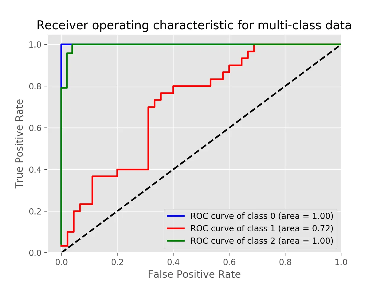
但现在我需要为多类分类任务这么做。我在某个地方读到需要对标签进行二值化,但我真的不知道如何计算多类分类的ROC。有什么提示吗?


2
ROC 的标准定义是基于二元分类的。您可以通过二值化或平均值来扩展它。请参见 sklearn 教程 - juanpa.arrivillaga
4个回答

49

正如评论中提到的,您需要使用 OneVsAll 方法将问题转换为二进制形式,这样您就会有 n_class 条 ROC 曲线。

以下是一个简单的例子:

from sklearn.metrics import roc_curve, auc
from sklearn import datasets
from sklearn.multiclass import OneVsRestClassifier
from sklearn.svm import LinearSVC
from sklearn.preprocessing import label_binarize
from sklearn.model_selection import train_test_split
import matplotlib.pyplot as plt

iris = datasets.load_iris()
X, y = iris.data, iris.target

y = label_binarize(y, classes=[0,1,2])
n_classes = 3

# shuffle and split training and test sets
X_train, X_test, y_train, y_test =\
    train_test_split(X, y, test_size=0.33, random_state=0)

# classifier
clf = OneVsRestClassifier(LinearSVC(random_state=0))
y_score = clf.fit(X_train, y_train).decision_function(X_test)

# Compute ROC curve and ROC area for each class
fpr = dict()
tpr = dict()
roc_auc = dict()
for i in range(n_classes):
    fpr[i], tpr[i], _ = roc_curve(y_test[:, i], y_score[:, i])
    roc_auc[i] = auc(fpr[i], tpr[i])

# Plot of a ROC curve for a specific class
for i in range(n_classes):
    plt.figure()
    plt.plot(fpr[i], tpr[i], label='ROC curve (area = %0.2f)' % roc_auc[i])
    plt.plot([0, 1], [0, 1], 'k--')
    plt.xlim([0.0, 1.0])
    plt.ylim([0.0, 1.05])
    plt.xlabel('False Positive Rate')
    plt.ylabel('True Positive Rate')
    plt.title('Receiver operating characteristic example')
    plt.legend(loc="lower right")
    plt.show()

输入图像描述输入图像描述输入图像描述


15

对我来说这很有效,如果您希望它们在同一图上,则很好。 这与@omdv的回答类似,但可能更简洁一些。

def plot_multiclass_roc(clf, X_test, y_test, n_classes, figsize=(17, 6)):
    y_score = clf.decision_function(X_test)

    # structures
    fpr = dict()
    tpr = dict()
    roc_auc = dict()

    # calculate dummies once
    y_test_dummies = pd.get_dummies(y_test, drop_first=False).values
    for i in range(n_classes):
        fpr[i], tpr[i], _ = roc_curve(y_test_dummies[:, i], y_score[:, i])
        roc_auc[i] = auc(fpr[i], tpr[i])

    # roc for each class
    fig, ax = plt.subplots(figsize=figsize)
    ax.plot([0, 1], [0, 1], 'k--')
    ax.set_xlim([0.0, 1.0])
    ax.set_ylim([0.0, 1.05])
    ax.set_xlabel('False Positive Rate')
    ax.set_ylabel('True Positive Rate')
    ax.set_title('Receiver operating characteristic example')
    for i in range(n_classes):
        ax.plot(fpr[i], tpr[i], label='ROC curve (area = %0.2f) for label %i' % (roc_auc[i], i))
    ax.legend(loc="best")
    ax.grid(alpha=.4)
    sns.despine()
    plt.show()

plot_multiclass_roc(full_pipeline, X_test, y_test, n_classes=16, figsize=(16, 10))

1
我们如何在随机森林中使用这段代码?随机森林没有decision_function。 - Amin
3
我相信你可以使用随机森林中的predict_proba。https://dev59.com/LrPma4cB1Zd3GeqPlyUX 此外,当这种情况不适用时,您可以将分类器包装在sklearn的CalibratedClassifier类中,以在先前没有概率时获得概率。 - pabz
我们如何使用这个函数进行GMM聚类。 - imhans33

4

使用label_binarize函数和以下代码绘制多类ROC曲线。根据你的应用程序调整和更改代码。


使用Iris数据的示例:

import matplotlib.pyplot as plt
from sklearn import svm, datasets
from sklearn.model_selection import train_test_split
from sklearn.preprocessing import label_binarize
from sklearn.metrics import roc_curve, auc
from sklearn.multiclass import OneVsRestClassifier
from itertools import cycle

iris = datasets.load_iris()
X = iris.data
y = iris.target

# Binarize the output
y = label_binarize(y, classes=[0, 1, 2])
n_classes = y.shape[1]

X_train, X_test, y_train, y_test = train_test_split(X, y, test_size=.5, random_state=0)

classifier = OneVsRestClassifier(svm.SVC(kernel='linear', probability=True,
                                 random_state=0))
y_score = classifier.fit(X_train, y_train).decision_function(X_test)

fpr = dict()
tpr = dict()
roc_auc = dict()
lw=2
for i in range(n_classes):
    fpr[i], tpr[i], _ = roc_curve(y_test[:, i], y_score[:, i])
    roc_auc[i] = auc(fpr[i], tpr[i])
colors = cycle(['blue', 'red', 'green'])
for i, color in zip(range(n_classes), colors):
    plt.plot(fpr[i], tpr[i], color=color, lw=2,
             label='ROC curve of class {0} (area = {1:0.2f})'
             ''.format(i, roc_auc[i]))
plt.plot([0, 1], [0, 1], 'k--', lw=lw)
plt.xlim([-0.05, 1.0])
plt.ylim([0.0, 1.05])
plt.xlabel('False Positive Rate')
plt.ylabel('True Positive Rate')
plt.title('Receiver operating characteristic for multi-class data')
plt.legend(loc="lower right")
plt.show()

在这个例子中,您可以打印y_score
print(y_score)

array([[-3.58459897, -0.3117717 ,  1.78242707],
       [-2.15411929,  1.11394949, -2.393737  ],
       [ 1.89199335, -3.89592195, -6.29685764],
       .
       .
       .

enter image description here


1
尝试使用这种方法。它对我也有效,而且非常简单易用。
from sklearn.metrics import roc_curve
from sklearn.metrics import roc_auc_score
from matplotlib import pyplot
from itertools import cycle
from sklearn.preprocessing import label_binarize
from sklearn.metrics import roc_curve, auc
from sklearn.preprocessing import OneHotEncoder

#One-hot encoder
y_valid=y_test.values.reshape(-1,1)
ypred=pred_final.reshape(-1,1)
y_valid = pd.DataFrame(y_test)
ypred=pd.DataFrame(pred_final)

onehotencoder = OneHotEncoder()
y_valid= onehotencoder.fit_transform(y_valid).toarray()
ypred = onehotencoder.fit_transform(ypred).toarray()

n_classes = ypred.shape[1]

# Plotting and estimation of FPR, TPR
fpr = dict()
tpr = dict()
roc_auc = dict()
for i in range(n_classes):
fpr[i], tpr[i], _ = roc_curve(y_valid[:, i], ypred[:, i])
roc_auc[i] = auc(fpr[i], tpr[i])
colors = cycle(['blue', 'green', 'red','darkorange','olive','purple','navy'])
for i, color in zip(range(n_classes), colors):
pyplot.plot(fpr[i], tpr[i], color=color, lw=1.5, label='ROC curve of class {0} 
(area = {1:0.2f})' ''.format(i+1, roc_auc[i]))
pyplot.plot([0, 1], [0, 1], 'k--', lw=1.5)
pyplot.xlim([-0.05, 1.0])
pyplot.ylim([0.0, 1.05])
pyplot.xlabel('False Positive Rate',fontsize=12, fontweight='bold')
pyplot.ylabel('True Positive Rate',fontsize=12, fontweight='bold')
pyplot.tick_params(labelsize=12)
pyplot.legend(loc="lower right")
ax = pyplot.axes()
pyplot.show()

1
目前你的回答不够清晰,请编辑并添加更多细节,以帮助其他人理解它如何回答问题。你可以在帮助中心找到有关如何编写好答案的更多信息。 - Community

网页内容由stack overflow 提供, 点击上面的
可以查看英文原文,
原文链接