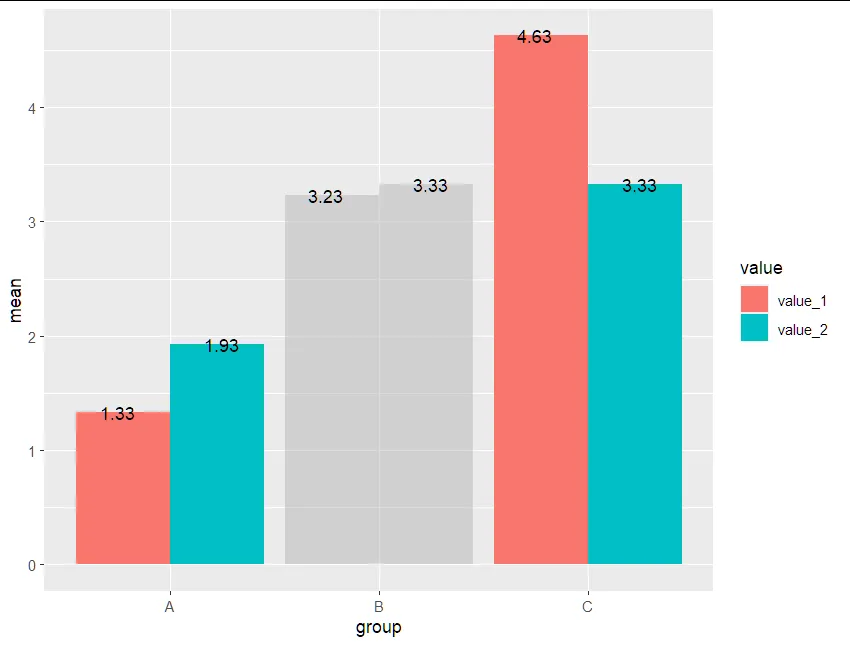
好的,经过长时间的默读后,这是我的第一个问题。我正在尝试为分组条形图添加未高亮项目的相应标签。当我在geom_text前面插入gghighlight时,我得到了以下绘图:
library(tidyverse)
library(gghighlight)


df <- data.frame (group = c("A", "A", "B", "B", "C", "C"),
                  value  = c("value_1", "value_2","value_1", "value_2","value_1", "value_2"),
                  mean = c(1.331, 1.931, 3.231, 3.331, 4.631, 3.331)
)

ggplot(data = df, aes(x = group, y = mean, fill = value)) +
  geom_bar(stat = "identity", position = "dodge") +
  gghighlight(group != "B",
              label_key = group
              ) +
  geom_text(aes(label = round(mean, digits = 2)),
            stat= "identity",
            vjust = -.5,
            position = position_dodge(width = .9)
            )
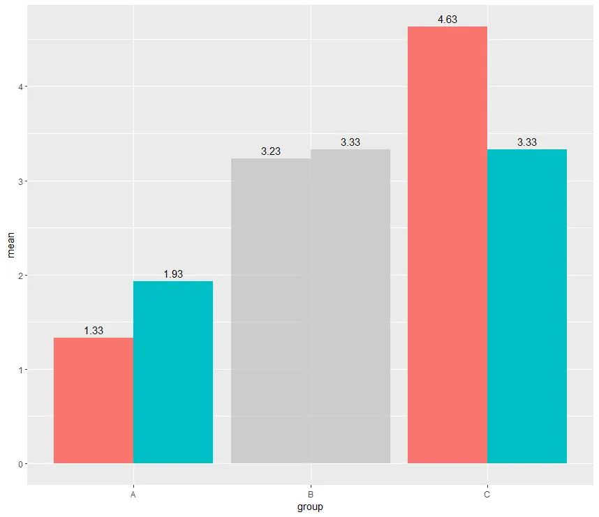
如果我将gghightlight移动到geom_text的后面,我会得到以下的图表:
ggplot(data = df, aes(x = group, y = mean, fill = value)) +
  geom_bar(stat = "identity", position = "dodge") +
  geom_text(aes(label = round(mean, digits = 2)),
            stat= "identity",
            vjust = -.5,
            position = position_dodge(width = .9)
            ) +
  gghighlight(group != "B",
              label_key = group)

是否有一种方法可以像高亮的那些一样给未高亮的条形添加标签?
谢谢提前。
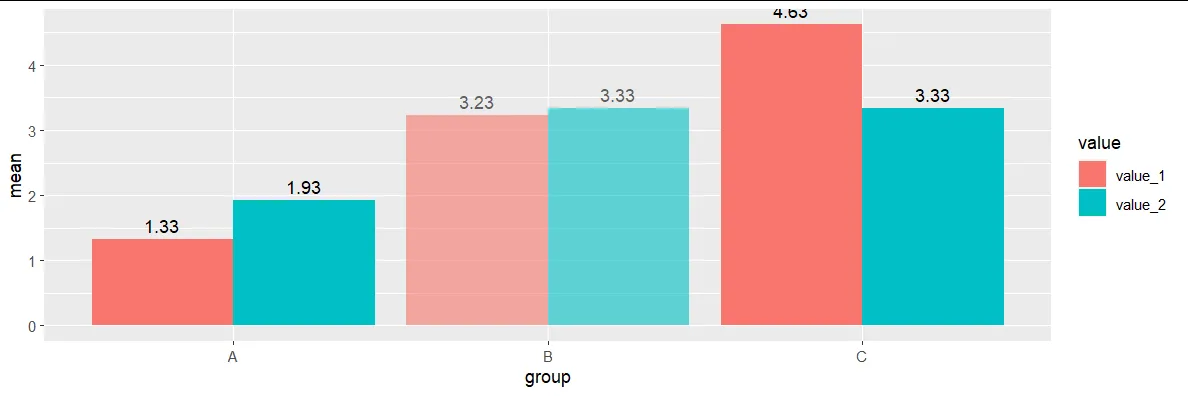
############# 编辑 ##############
除了将某些列变为灰色(参见@TarJae的答案),还可以使它们变得透明(此帖子的关键部分来自:ggplot透明度对个别柱的影响):
subset_df <- df %>%
  mutate(alpha.adj = as.factor(ifelse(group != "B", 1, 0.6)))


ggplot(data = subset_df, aes(x = group, y = mean, fill = value, alpha=factor(alpha.adj))) +
  geom_bar(stat = "identity", position = "dodge") +
  geom_text(aes(label = round(mean, digits = 2)),
            stat= "identity",
            vjust = -.5,
            position = position_dodge(width = .9)
  ) +
  scale_alpha_manual(values = c("0.6"=0.6, "1"=1), guide='none')
[ ]
]