使flexbox内元素的宽度动态化

9

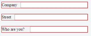
嗯,我不太擅长使用flex,因为我很少使用它,但是我认为没有其他方法可以实现这一点。我想制作一个简单的表单,在右侧有带描述的标签和输入框。这个描述可以有任何大小,输入框将增加其大小以满足父元素。以下是代码:

div {
    display: flex;
    width: 300px;
    margin-bottom: 20px;
    border: 1px solid red;
}
label {
    height: 21px;
    line-height: 21px;
    font-size: 14px;
    color: black;
    flex: 1;
}
input {
    margin-left: 20px;
    flex: 1;
}
<div>
    <label>Company</label>
    <input type="text">
</div>
<div>
    <label>Street</label>
    <input type="text">
</div>
<div>
    <label>Who are you?</label>
    <input type="text">
</div>

它应该像这样:

enter image description here


也许 Bootstrap 的 input-group-addon 可以帮到你。可以去这里查看一下:https://v4-alpha.getbootstrap.com/components/input-group/ - Shivkumar kondi
消除所有这些样式(背景、填充、边框等)将需要更多的工作。无论如何,我使用基础库,所以会有冲突。 - Patrik Krehák
2个回答

14
你只需要将label的flex属性设置为:flex: 0 1 auto。这意味着:flex-grow: 0flex-shrink: 1flex-basis: auto

div {
    display: flex;
    width: 300px;
    margin-bottom: 20px;
    border: 1px solid red;
}
label {
    height: 21px;
    line-height: 21px;
    font-size: 14px;
    color: black;
    flex: 0 1 auto;
}
input {
    margin-left: 20px;
    flex: 1;
}
<div>
    <label>Company</label>
    <input type="text">
</div>
<div>
    <label>Street</label>
    <input type="text">
</div>
<div>
    <label>Who are you?</label>
    <input type="text">
</div>


1
如果您将div宽度从“300px”更改为“200px”,则此操作会失败。 为了解决问题,还需设置输入的“min-width: 0”。 - EricP

3

只需在标签和输入标签中添加 flex-order 属性即可。查看此处 http://codepen.io/tantata/pen/KNoMWQ

div {
    display: flex;
    width: 300px;
    margin-bottom: 20px;
    border: 1px solid red;
    flex-wrap:nowrap;
}
label {
    height: 21px;
    line-height: 21px;
    font-size: 14px;
    color: black;
    flex-grow: 0;
}
input {
    margin-left: 20px;
    flex-grow: 1;
}
<div>
    <label>Company</label>
    <input type="text">
</div>
<div>
    <label>Street</label>
    <input type="text">
</div>
<div>
    <label>Who are you?</label>
    <input type="text">
</div>


网页内容由stack overflow 提供, 点击上面的
可以查看英文原文,
原文链接