检测移动设备的“刘海屏”

19

随着iPhone X的推出即将到来,我正在尝试提前准备我的一些Web应用程序,以处理任何设计变化-其中最大的是容纳前置摄像头的新“刘海”。

我想知道是否有办法在Javascript中以某种方式检测到这一点,或者可能会有。

有趣的是,Chris Coyier写了一篇关于“Notch”和CSS的文章,这让我发现了safe-area-inset-right常量。是否有办法在Javascript中访问它,并且这是一个可靠的测试。

if (window.constant.safeAreaInsetRight) {
  var notch = true;
}
7个回答

18

“--sa*” 属性是什么?谷歌无法帮助我。编辑:哦,是 CSS 自定义属性。对我来说是新的,谢谢! - Dmitry Minkovsky
2
这些是CSS变量,作者只是这样命名它,它代表安全区域顶部。 - Kamil Jopek

8

虽然这可能有点繁琐,但获得屏幕可用高度和宽度并将其与iPhone X的规格进行匹配将帮助我们确定它是否是iPhone X。

请注意:

在纵向方向上,iPhone X 的显示屏宽度与 iPhone 6、iPhone 7 和 iPhone 8 的 4.7 英寸显示屏宽度相同。但是,iPhone X 的显示屏比 4.7 英寸的显示屏多了 145pt 的高度...

image description here

首先,您需要通过 userAgent 检查是否为 iPhone,其次,您将检查实际屏幕的区域(不包括默认为纵向的方向),最后,一旦我们知道它是 iPhone X,就可以根据上图中 iPhone X 下面的表格确定方向。

if (navigator.userAgent.match(/(iPhone)/)){
  if((screen.availHeight == 812) && (screen.availWidth == 375)){

    if((window.innerHeight == "375") && (window.innerWidth == "812")){
      // iPhone X Landscape

    }else{
      // iPhone X Portrait
    }
  }
}

参考资料:

可用高度(avilHeight)

可用宽度(avilWidth)

iPhoneX规格

至于CSS解决方案,我昨天找到了一篇有趣的文章,可能会对您有所帮助。

假设您有一个固定位置的头部栏,在iOS 10上的CSS当前看起来像这样:

header {
    position: fixed;
    top: 0;
    left: 0;
    right: 0;
    height: 44px;

    padding-top: 20px; /* Status bar height */
}

为了使其自动适应iPhone X和其他iOS 11设备,您需要在viewport meta标签中添加viewport-fit = cover选项,并更改CSS以引用该常量。
header {
    /* ... */

    /* Status bar height on iOS 10 */
    padding-top: 20px;

    /* Status bar height on iOS 11+ */
    padding-top: constant(safe-area-inset-top);
}

在旧设备上,可能无法解释constant()语法,因此保留回退值很重要。您还可以在CSS calc()表达式中使用常量。

文章


7

自@youssef-makboul的回答以来,并得到了@hjellek的评论,iOS已从constant()更改为env()语法,需要一个后备方案来支持所有当前iPhone X iOS版本的这种方法。

const hasNotch = function () {
    var proceed = false;
    var div = document.createElement('div');
    if (CSS.supports('padding-bottom: env(safe-area-inset-bottom)')) {
        div.style.paddingBottom = 'env(safe-area-inset-bottom)';
        proceed = true;
    } else if (CSS.supports('padding-bottom: constant(safe-area-inset-bottom)')) {
        div.style.paddingBottom = 'constant(safe-area-inset-bottom)';
        proceed = true;
    }
    if (proceed) {
        document.body.appendChild(div);
        let calculatedPadding = parseInt(window.getComputedStyle(div).paddingBottom);
        document.body.removeChild(div);
        if (calculatedPadding > 0) {
            return true;
        }
    }
    return false;
};

6
// iphone X detection

function hasNotch() {
    if (CSS.supports('padding-bottom: env(safe-area-inset-bottom)')) {
      let div = document.createElement('div');
      div.style.paddingBottom = 'env(safe-area-inset-bottom)';
      document.body.appendChild(div);
      let calculatedPadding = parseInt(window.getComputedStyle(div).paddingBottom, 10);
      document.body.removeChild(div);
      if (calculatedPadding > 0) {
        return true;
      }
    }
    return false;
  }

我们无法确定非 iPhone X 设备上的 iOS Safari 是否支持新的 CSS 常量。 - Terry
{btsdaf} - Youssef Makboul
我喜欢你这里的灵活性。相对简单,可以在许多情况下使用。 - tonejac
1
感谢您的解决方案!然而,自从官方发布以来,常量(safe-area-inset-bottom)已经不再起作用 - 您必须改用env(safe-area-inset-bottom)。https://webkit.org/blog/7929/designing-websites-for-iphone-x/提到了这个变化。 - hjellek
这个不再起作用了,似乎由于常规状态栏,现在所有全屏WebView都有一个calculatedPadding >= 0。也许可以检查一下calculatedPadding > 40? - Gregory Magarshak

2

添加notch-detected-event(0.7k纯JS)

如果检测到凹口,它会向HTML元素添加HTML5数据属性

<html data-notch="true" data-orientation="portrait">

这样您就可以使用CSS调整布局:

/* make room for the notch at the top */
html[data-notch="true"][data-orientation="portrait"] body {
  padding-top: 44px;
  height: calc(100% - 44px);
}

/* make room for the notch at the sides */
html[data-notch="true"][data-orientation="landscape"] body {
  padding-left: 44px;
  padding-right: 44px;
  width: calc(100% - 44px - 44px);
}

或者监听检测到凹口事件并执行一些JS:

window.addEventListener('notch-detected', function(e) {
  console.log("Notch detected, move shit around");
});

0

需要补充的几点:

确保在您的index.html文件中包含以下内容:

<meta name="viewport" content="width=device-width, initial-scale=1.0, viewport-fit=cover">

此外:

这里有一篇很棒的文章:CSS Tricks Notch


0

我使用这个:

function hasNotch() {

    //iphone X 1.11
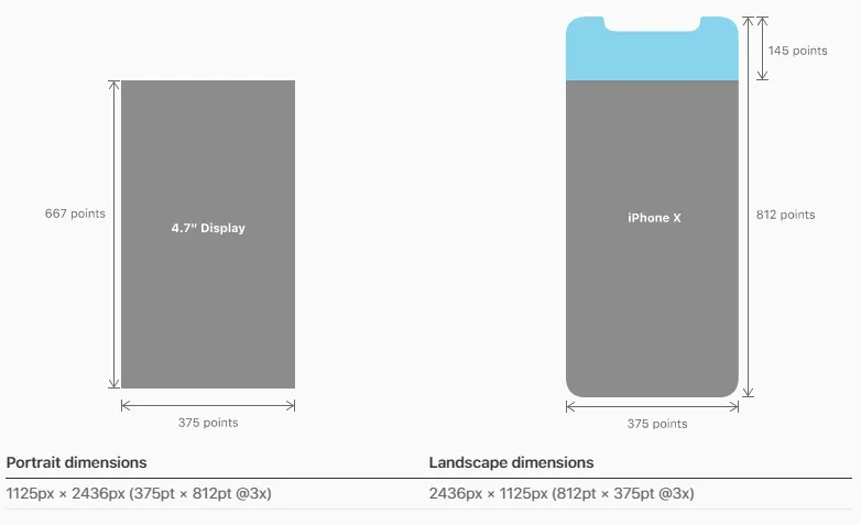
    if (document.documentElement.clientHeight == 812 && document.documentElement.clientHeight == 375 && !!window.matchMedia && window.matchMedia("only screen and (-webkit-device-pixel-ratio: 3)").matches && iOSversion()[0] == 11) {
        return true;
    }

    var proceed = false;
    var div = document.createElement('div');
    if (CSS.supports('padding-bottom: env(safe-area-inset-bottom)')) {

        div.style.paddingBottom = 'env(safe-area-inset-bottom)';
        proceed = true;
    } else if (CSS.supports('padding-bottom: constant(safe-area-inset-bottom)')) {

        div.style.paddingBottom = 'constant(safe-area-inset-bottom)';
        proceed = true;
    }
    if (proceed) {
        return true;
    }

    return false;
};

CSS 是 TypeScript 的全局界面库:

interface CSS {
    escape(value: string): string;
    supports(property: string, value?: string): boolean;
}
declare var CSS: CSS;

或者用CSS

$margin_max_constant_notch:unquote('max(-12px, constant(safe-area-inset-left))');
$margin_max_env_notch:unquote('max(-12px, env(safe-area-inset-left))');

/*** iphone X 1.11, iphone XS (quote is OR) ***/
@media only screen
and (device-width : 375px)
and (max-device-width : 812px)
and (-webkit-device-pixel-ratio : 3),
 /*** iphone XR ***/
screen and (device-width : 414px)
and (device-height : 896px)
and (-webkit-device-pixel-ratio : 2),
  /*** iphone XS Max ***/
screen and (device-width : 414px)
and (device-height : 896px)
and (-webkit-device-pixel-ratio : 3),
  /*** iphone XS Max Retina ***/
only screen and (-webkit-min-device-pixel-ratio: 3),
only screen and (   min--moz-device-pixel-ratio: 3),
only screen and (     -o-min-device-pixel-ratio: 3/1),
only screen and (        min-device-pixel-ratio: 3),
only screen and (                min-resolution: 458dpi),
only screen and (                min-resolution: 3dppx),
/** Google Pixel 3 XL  **/
screen and (device-width: 360px)
and (device-height: 740px)
and (-webkit-min-device-pixel-ratio: 4),
only screen and (   min--moz-device-pixel-ratio: 4),
only screen and (     -o-min-device-pixel-ratio: 4/1),
only screen and (        min-device-pixel-ratio: 4),
only screen and (                min-resolution: 523dpi),
only screen and (                min-resolution: 4dppx) {

    @media(orientation: portrait) {

       /* mobile - vertical */


        @media (max-width: 768px) {
         /* up to 768px */
        }

        @media (max-width: 480px) {
         /* up to 480px */
        }

       @media only screen and (max-width: 400px) {
           /* up to 400px */
        }


    }
    @media(orientation: landscape) {
        html,body {
            padding: $margin_max_constant_notch;
            padding: $margin_max_env_notch;
        }

        /* mobile - horizontal */

        @media screen and (max-width: 900px) {

          /* up to 900px */
        }

    }
}

/** iphone X 1.12 **/
@supports(padding: max(0px)) {
@media screen and (device-width : 375px)
and (device-height : 812px)
and (-webkit-device-pixel-ratio : 3) {
    @media(orientation: portrait) {

       /* mobile - vertical */

        @media (max-width: 768px) {
           //até 768px
        }

        @media (max-width: 480px) {
         /* up to 480px */
        }

        @media only screen and (max-width: 400px) {
        /* up to 400px */
        }

      }
      @media(orientation: landscape) {
        html, body {
          padding: $margin_max_constant_notch;
          padding: $margin_max_env_notch;
        }

        @media screen and (max-width: 900px) {
         /* up to 900px */
        }
      }
   }
}

/** iphone 8 **/
@media only screen
and (device-width : 375px)
and (device-height : 667px)
and (-webkit-device-pixel-ratio : 2),
  /** iphone 8 PLUS **/
screen  and (device-width : 414px)
and (device-height : 736px)
and (-webkit-device-pixel-ratio : 3) {
  @media(orientation: portrait) {

  /* mobile - vertical */

  }
  @media(orientation: landscape) {

  /* mobile - horizontal */
  }
}

@media only screen
  /** IPADS **/
and (min-device-width: 1024px)
and (max-device-width: 1366px)
and (-webkit-min-device-pixel-ratio: 2) {

 /* for ipads */

  @media(orientation: portrait) {

  /* ipad - vertical */

  }
  @media(orientation: landscape) {

  /* ipad - horizontal */
  }

}

网页内容由stack overflow 提供, 点击上面的
可以查看英文原文,
原文链接