在 CSS 中制作加号符号

11

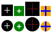
我有下面这段CSS代码,它显示了+符号,但与设计不匹配,基本上需要变得更细。请查看片段和CodePen

.plus {
  position:relative;
  border: 1px dotted white;
  width: 3px;
  height: 3px;
  background-color: black;
  box-sizing: border-box;
  transform: scale(11);
}
<div class="plus"></div>

应该看起来像下面的符号:CSS中的加号符号

其他任何样式对我来说都可以,但是应该像快照一样。

5个回答

35
我们可以使用以下类似的渐变来实现此目标:

.plus {
  --b: 4px; /* the thickness */
  width: 40px; /* the size */
  aspect-ratio: 1;
  border: 10px solid #000; /* the outer space */
  background:
    conic-gradient(from 90deg at var(--b) var(--b),#000 90deg,#fff 0) 
    calc(100% + var(--b)/2) calc(100% + var(--b)/2)/
    calc(50%  + var(--b))   calc(50%  + var(--b));
  display: inline-block;
}

.alt {
  border: none;
  margin: 10px;
  background:
    conic-gradient(from 90deg at var(--b) var(--b),#fff 90deg,#000 0) 
    calc(100% + var(--b)/2) calc(100% + var(--b)/2)/
    calc(50%  + var(--b))   calc(50%  + var(--b));
}
.radius {
  border-radius: 50%;
}
<div class="plus">
</div>

<div class="plus alt">
</div>

<div class="plus radius">
</div>


旧回答

使用如下的多重背景:

.plus {
  display:inline-block;
  width:50px;
  height:50px;
  
  background:
    linear-gradient(#fff 0 0),
    linear-gradient(#fff 0 0),
    #000;
  background-position:center;
  background-size: 50% 2px,2px 50%; /*thickness = 2px, length = 50% (25px)*/
  background-repeat:no-repeat;
}

.alt {
  background:
    linear-gradient(#000 0 0),
    linear-gradient(#000 0 0);
  background-position:center;
  background-size: 50% 2px,2px 50%; /*thickness = 2px, length = 50% (25px)*/
  background-repeat:no-repeat;
}
.radius {
  border-radius:50%;
}
<div class="plus">
</div>

<div class="plus alt">
</div>

<div class="plus radius">
</div>

plus sign CSS

这里是带透明度的效果:

.plus {
  width:50px;
  height:50px;
  display:inline-block;
  
  background:
    linear-gradient(#000 0 0) top left,
    linear-gradient(#000 0 0) top right,
    linear-gradient(#000 0 0) bottom left,
    linear-gradient(#000 0 0) bottom right;
  background-size: calc(50% - 1px) calc(50% - 1px); /*thickness = 2px (2*1px) */
  background-repeat:no-repeat;
  border:10px solid #000; /*length = 30px (50px - 2x10px) */
  box-sizing:border-box;
}

.radius {
  border-radius:50%;
}

body {
 background:pink;
}
<div class="plus">
</div>

<div class="plus radius">
</div>

plus symbol with CSS

我们可以添加CSS变量来轻松控制整体形状:

.plus {
  --t:2px;   /* Thickness */
  --l:40px;  /* size of the symbol */
  --s:10px;  /* space around the symbol */
  --c1:#fff; /* Plus color*/
  --c2:#000; /* background color*/

  display:inline-block;
  width:var(--l);
  height:var(--l);
  padding:var(--s);
  box-sizing:border-box; /*Remove this if you don't want space to be included in the size*/
  
  background:
    linear-gradient(var(--c1) 0 0) content-box,
    linear-gradient(var(--c1) 0 0) content-box,
    var(--c2);
  background-position:center;
  background-size: 100% var(--t),var(--t) 100%;
  background-repeat:no-repeat;
}

.radius {
  border-radius:50%;
}
<div class="plus"></div>
<div class="plus" style="--l:35px;--t:3px;--c2:green"></div>
<div class="plus" style="--l:50px;--t:1px;--s:5px;--c1:red;"></div>
<div class="plus" style="--l:35px;--t:5px;--s:0px;--c1:blue;--c2:orange;"></div>

<br>
<div class="plus radius"></div>
<div class="plus radius" style="--l:35px;--t:3px;--c2:green"></div>
<div class="plus radius" style="--l:50px;--t:1px;--s:5px;--c1:red;"></div>
<div class="plus radius" style="--l:35px;--t:5px;--s:0px;--c1:blue;--c2:orange;"></div>

plus sign with CSS


5
太棒了! - Roman
很棒的解决方案!! - Omar
哇,试图理解这个“background”魔法,真是一项艰苦的工作! - Ahmed Fasih

4

我建议使用伪元素before和after来实现这个效果。

基本上,我将div用作黑色背景,将before元素用作垂直线,将after元素用作水平线。

.plus {
  position: relative;
  width:20px;
  height:20px;
  background:#000;
}

.plus:before,
.plus:after {
  content: "";
  position:absolute;
  background:#fff;
}

/* the vertical line */
.plus:before {
  left:50%;
  top:4px; /* this defines how much black "border" there should be */
  bottom:4px;
  width:2px;
  transform:translateX(-50%);
}

/* the horizontal line */
.plus:after {
  top:50%;
  left:4px;
  right:4px;
  height:2px;
  transform:translateY(-50%);
}

这是一个完整的示例:https://codepen.io/Fitzi/pen/zbMBVw

2
你可以使用CSS的content属性来实现这一点:

你可以通过使用CSS的content属性来实现这一点:

.plus {
  height: 24px;
  width: 24px;
  display: inline-block;
  background-color: black;
  color: white;
  font-size: 24px;
  line-height: 24px;
  text-align: center;
}

.plus::before {
  content: "+";
}

这是一个展示上述代码的Fiddle,点击这里。"Original Answer"翻译成"最初的回答"。

1
我建议使用实际符号:

.plus {
  display: block;
  height: 0.6em;
  width: 0.6em;
  font-size: 100px;
  text-align: center;
  line-height: 0.5em;
  margin: 0;
  padding: 0;
  text-rendering: optimizeLegibility;
  -webkit-font-smoothing: antialiased;
  font-family: Frutiger, "Frutiger Linotype", Univers, Calibri, "Gill Sans", "Gill Sans MT", "Myriad Pro", Myriad, "DejaVu Sans Condensed", "Liberation Sans", "Nimbus Sans L", Tahoma, Geneva, "Helvetica Neue", Helvetica, Arial, sans-serif;
  font-weight: lighter;
  color: #ffffff;
  background-color: #000000;
}

.plus::before {
  display: block;
  content: '+';
}
<div class="plus"></div> 

小提琴: https://jsfiddle.net/m5de0ycL/

然后只需更改大小的字体大小,如果对您来说不够细,则可以将字体系列更改为更窄的字体。

编辑:@Temani-Afif的解决方案更加多样化。根据您的兼容性需求,我建议使用他的解决方案:在CSS中制作加号符号


-1

.plus::before {
    position: absolute;
    content: "+";
    font-size: 20px;
    line-height: 15px;
    background-color: black;
    color: white;
    width: 20px;
    height: 20px;
    right: 0;
    top: 0;
    cursor: pointer;
    pointer-events: none;
}


你的回答可以通过提供更多支持信息来改进。请编辑以添加进一步的细节,例如引用或文档,以便他人可以确认你的答案是正确的。您可以在帮助中心中找到有关如何编写良好答案的更多信息。 - Community

网页内容由stack overflow 提供, 点击上面的
可以查看英文原文,
原文链接