我正在制作一个项目列表,但是有一些挑战:
- 响应式;
- "标题"可能有多行;
- 有时需要显示带有背景色的图标而不是完整的图片。
这是我期望的最终效果的图片:
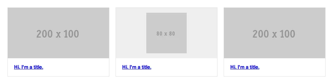
而我得到的却是:http://codepen.io/caio/pen/ygkfm/
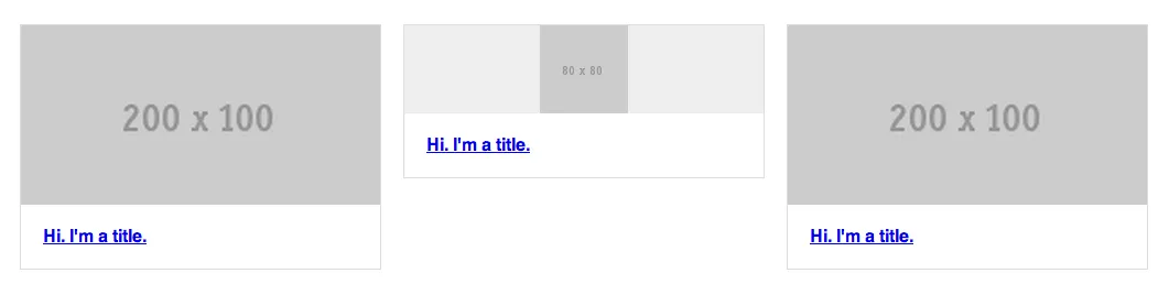
你可以看到,当"image" div中有一个图标时,我无法对其设置相同的缩放比例。有没有解决我的问题的方法?
我正在制作一个项目列表,但是有一些挑战:
这是我期望的最终效果的图片:
而我得到的却是:http://codepen.io/caio/pen/ygkfm/
你可以看到,当"image" div中有一个图标时,我无法对其设置相同的缩放比例。有没有解决我的问题的方法?
我假设你的图片(除了图标)与你的示例具有相同的宽高比。
在这种情况下,你可以使用padding-bottom来保持图像容器的高度。由于padding-bottom是根据容器的宽度计算的,因此无论内容如何它都会保持其宽高比(你将不得不使用position:absolute;定位内容,以便它不会改变容器的尺寸)。
这里有一个演示,展示了你可以做什么。很抱歉我不熟悉CodePen
我还添加了另一个容器来使图标水平居中。
* {
    -webkit-box-sizing: border-box;
    -moz-box-sizing: border-box;
    box-sizing: border-box;
}
.items {
    margin: 50px auto 0;
    width: 90%;
    *zoom: 1;
}
.items:before, .items:after {
    content:" ";
    display: table;
}
.items:after {
    clear: both;
}
.items .item {
    border: 1px solid #ddd;
    float: left;
    width: 32%;
}
.items .item:nth-child(3n+2) {
    margin: 0 2%;
}
.items .item .image {
    background: #eee;
    padding-bottom:50%;
    position:relative;
}
.items .item .image .img_in{
    position:absolute;
    width:100%;
    height:100%;
    text-align:center;
}
.items .item .image img {
    display: block;
    width: 100%;
    height:100%;
}
.items .item .image img.icon {
    height: 80%;
    margin:0 auto;
    position: relative;
    top: 10%;
    width: auto;
}
.items .item .title {
    margin: 0;
    padding: 20px;
}
很简单
将以下内容添加到.items .item .image
当您拥有200像素和100像素的“普通”宽度和高度时,50%代表宽度的50%(200 * 50%= 100)
{
    height: 0;
    padding-bottom: 50%;
}
点击此处查看代码示例。
您可以使用 SCSS 的 percentage 函数:
padding-bottom: percentage(100px / 200px);
position:absolute; bottom:0px,并确保.item具有position:relative。我认为你的做法有误,如果一切都基于宽度百分比,那么除非使用JS,否则无法知道高度,因此你需要将宽度更改为更合适的值以实现你的目标。
将你的CSS更改为:
.icon {
    margin: 0 auto;
    padding: 5% 0;
    width: 40%;
}
并且它将看起来更像你想要的样子。我更新了你的CodePen
HTML
  <a href="#" class="item">
    <div class="image">
      <div><img src="http://placehold.it/200x100"></div>
    </div>
    <h4 class="title">Hi. I'm a title.</h4>
  </a>

  <a href="#" class="item">
    <div class="image">
      <div><img src="http://placehold.it/80x80" class="icon"></div>
    </div>
    <h4 class="title">Hi. I'm a title.</h4>
  </a>

  <a href="#" class="item">
    <div class="image">
      <div><img src="http://placehold.it/200x100"></div>
    </div>
    <h4 class="title">Hi. I'm a title.</h4>
  </a>
</div>
SCSS
* { @include box-sizing(border-box); }

.items {
  margin: 50px auto 0;
  width: 90%;
  @include clearfix;

  .item {
    border: 1px solid #ddd;
    float: left;
    width: 32%;
    &:nth-child(3n+2) { margin: 0 2%; }

    .image {
      background: #eee;
      min-height:100px;
      max-height:100px;
      display:table;
      width:100%;

      &> div {

      display:table-cell;
      text-align:center;
      vertical-align:middle;
      }

      img {
        max-width:100%;
        height:100%;
        margin:0 auto;
        &.icon {
          height: 80%;
          margin: 0 auto;
          position: relative;
          top: 10%;
          width: auto;
        }
      }
    }

    .title {
      margin: 0;
      padding: 20px;
    }
  }
}
.box{
    position: relative;
    width: 50%;     /* desired width */
}
.box:before{
    content: "";
    display: block;
    padding-top: 100%;  /* initial ratio of 1:1*/
}

.content{
    position:  absolute;
    top: 0;
    left: 0;
    bottom: 0;
    right: 0;
}
/* Other ratios */
.ratio2_1:before{
    padding-top: 50%;
}
.ratio1_2:before{
    padding-top: 200%;
}
.ratio4_3:before{
    padding-top: 75%;
}
.ratio16_9:before{
    padding-top: 56.25%;
}
<div class='box'>
    <div class='content'>Aspect ratio of 1:1</div>
</div>
<div class='box ratio16_9'>
    <div class='content'>Aspect ratio of 16:9</div>
</div>
.items .item .image img 添加了一个相同值的最大高度和最小高度:.items .item .image img {
display: block;
width: 100%;
max-height:23%;
min-height:23%;
}
我不太确定你想要实现什么,但如果我理解正确,那么这就是你要找的代码。以下是完整代码:
HTML
<div class="items">
<a href="#" class="item">
<div class="image">
<img src="http://placehold.it/200x100" />
</div>
<h4 class="title">Hi. I'm a title.</h4>
</a>
<a href="#" class="item">
<div class="image">
<img src="http://placehold.it/80x80" class="icon" />
</div>
<h4 class="title">Hi. I'm a title.</h4>
</a>
<a href="#" class="item">
<div class="image">
<img src="http://placehold.it/200x100" />
</div>
<h4 class="title">Hi. I'm a title.</h4>
</a>
</div>
CSS
* {
@include box-sizing(border-box);
}
.items {
margin: 50px auto 0;
width: 90%;
@include clearfix;
}
.item {
border: 1px solid #ddd;
float: left;
width: 30%;
}
.items .item .image {
background: #eee;
}
.items .item .image img {
    display: block;
    width: 100%;
    max-height:23%;
    min-height:23%;
}
.items .item .title {
margin: 0;
padding: 20px;
}
.icon {
height: 80%;
margin: 0 auto;
position: relative;
top: 10%;
width: auto;
}
.items .item:nth-child(3n+2) {
margin: 0 2%;
}
这里有一个FIDDLE
vertical-padding,来强制你的 div 保持与 2:1 图像相同的比例或不同。
演示和基本的CSS:
.image:before {
  content:'';
  display:inline-block;
  vertical-align:middle;
  padding-top:50%;/* equals 50% of width of parent */
  width:0;
  box-shadow:0 0 0 5px red;/* let's see where it stands for demo purpose */
}
我在演示中提供了另一个版本的链接,其中图像可以比所需的初始空间更大,而不会破坏布局(基于元素保持在流中的想法,没有涉及absolute定位):EXTRA
或许你可以尝试使用这个 jQuery 库 http://brm.io/jquery-match-height/
使用它时,你需要为那些你想要匹配高度的元素分配数据属性,它会计算每个元素的高度以确保它们都相同。它会考虑到 padding、margin、border 和 box-sizing。
.items .item .image {height: 200px}。 - Nickheight: 80%;。这是缩放,但父级div需要与其他元素相同大小。 - Caio Tarifaheight: 80%,并在顶部和底部留出10%的空间(居中对齐)。 - Caio Tarifa