在Internet Explorer中居中元素无法正常工作

4

我正在使用一个经常被引用的类来在弹性容器中水平和垂直居中我的内容。它在所有现代浏览器中都可以工作,但是即使是相当新的Internet Explorer版本也让我感到困扰。

这是我标记的相关部分,利用Bootstrap的embed-responsive类来保持比例。

HTML

<div class="container-fluid embed-responsive embed-responsive-16by9" style="background: linear-gradient(to bottom, rgba(0,0,0,0) 0%,rgba(0,0,0,0.5) 100%), url('http://placehold.it/800X600') no-repeat;background-size:cover;background-position:center">
  <div class="content-center">
    <div class="container">
      <div class="row">
        <div class="col-xs-12 text-center">
          <button id="play-video" type="button" class="btn btn-default" data-toggle="modal" data-target="#video-modal" data-youtube="scWpXEYZEGk">
            Play
          </button>
        </div>
      </div>
    </div>
  </div>
</div>

CSS:

.content-center {
    position: absolute;
    top: 0;
    bottom: 0;
    left: 0;
    right: 0;
    display: -webkit-box;
    display: -webkit-flex;
    display: -ms-flexbox;
    display: flex;
    -webkit-box-align: center;
    -webkit-align-items: center;
    -ms-flex-align: center;
    -ms-flex-pack: center;
    align-items: center;
    -webkit-box-pack: center;
    -webkit-justify-content: center;
    -ms-flex-pack: center;
    justify-content: center;
    float: none;
}

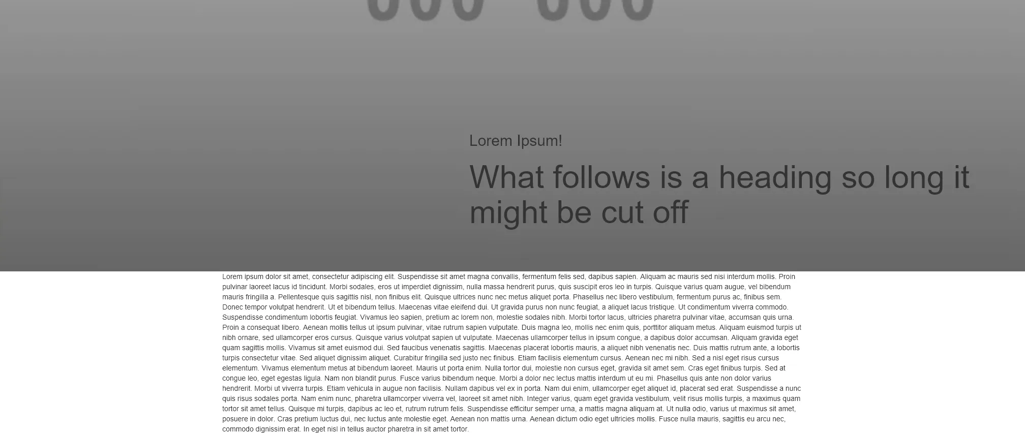
很遗憾,元素并没有居中,而是在页面的右侧。

这里有一张截图作为参考:

enter image description here

jsFiddle


在IE11、IE10、FF和Chrome中,一切看起来都居中。在所有浏览器中几乎相同。绝对不会在任何一个浏览器中出现“在页面右侧”的情况。不确定您使用的IE版本,但这里有一些关于flexbox的浏览器兼容性数据:https://dev59.com/FlsW5IYBdhLWcg3wTly8#35137869 - Michael Benjamin
我在Edge浏览器中测试了IE10和IE11的兼容模式,因为这两个版本对我很重要。如果您的屏幕较小,您可能需要放大fiddle,缩放应该是一个解决方法。 - idleberg
@Michael_B 我已经在帖子里加入了一张截图。 - idleberg
1个回答

8
问题是由以下两个因素共同导致的:
  • 作者和Bootstrap样式之间的冲突
  • IE渲染行为有误
这是相关代码:

Bootstrap样式:

.container {
    padding-right: 15px;
    padding-left: 15px;
    margin-right: auto;   /* <-- source of the problem in IE */
    margin-left: auto;    /* <-- source of the problem in IE */
}

作者样式:

.content-bottom {
    position: absolute;
    bottom: 0;
    left: 0;
    right: 0;
    display: flex;
    align-items: center;
    justify-content: center; /* <-- source of the problem in IE */
    float: none;
    max-height: 30%;
}

简而言之,要在IE中使内容居中,使用auto边距或justify-content: center。同时使用两者会破坏IE中的居中效果,因为CSS优先级的实现有误。详情请参见我的答案:Flex auto margin not working in IE10/11修订后的演示(已禁用justify-content)。

网页内容由stack overflow 提供, 点击上面的
可以查看英文原文,
原文链接