以下是HTML5和CSS3动画,我遇到了两个不同的问题,但我无法找到之前的答案适用于我的代码。我很好奇我是否在这里做错了什么。
我尝试了此问题中的解决方案和这个,但没有结果。
两个问题:
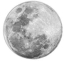
1)月球轨道变换良好;月球作为子元素也会变换。我尝试应用相反的变换,但似乎没有任何效果。
2)我正在尝试更改z-index,使月球位于行星后面。轨道边框是临时的,所以不用担心,但无论我将z-index设置为多少,都无法获得效果。
body {
height: 100%;
top: 0px;
bottom: 0px;
margin-top: 300px;
background-color: #143856;
}
.moonorbit {
position: relative;
top: -249px;
left: 309px;
width: 500px;
height: 500px;
border: 2px solid white;
border-radius: 50%;
-moz-transform: rotateX(75deg);
-webkit-transform: rotateX(75deg);
-o-transform: rotateX(75deg);
-ms-transform: rotateX(75deg);
transform: rotateX(75deg);
}
.mooncontainer {
position: absolute;
top: 175px;
left: 175px;
width: 150px !important;
height: 150px;
-moz-transform: rotateX(-75deg);
-webkit-transform: rotateX(-75deg);
-o-transform: rotateX(-75deg);
-ms-transform: rotateX(-75deg);
transform: rotateX(-75deg);
animation: moon-orbit 10s linear infinite;
}
.moon {
width: 150px !important;
height: 150px;
border-radius: 50%;
background: red url(img/planets_MOON.png) no-repeat;
background-size: cover;
animation: rotate 10s linear infinite;
}
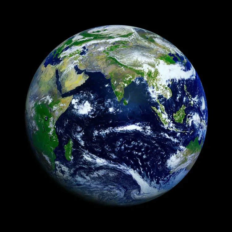
.earth {
position: absolute;
width: 417px;
top: 100px;
left: 350px;
z-index: 0;
height: 209px;
}
.earth .planet {
/*width: 417px !important;
height: 417px;*/
width: 300px !important;
height: 300px;
background: yellow url(img/planets_EARTH.png) no-repeat;
background-size: cover;
border-radius: 50%;
margin: 0 auto;
}
/*Moon Orbit*/
@keyframes moon-orbit {
0% {
transform: rotateZ(0deg) translateX(250px);
}
100% {
transform: rotateZ(360deg) translateX(250px);
}
}
@keyframes rotate {
0% {
z-index: 5;
transform: rotateZ(0deg);
}
25% {
z-index: -5;
}
50% {
z-index: -5;
}
75% {
z-index: 5;
}
100% {
z-index: 5;
transform: rotateZ(-360deg);
}
}<body>
  <div class="earth">
    <div class="planet"></div>
  </div>
  <div class="moonorbit">
    <div class="mooncontainer">
      <div class="moon"></div>
    </div>
  </div>
</body>