如何仅更改CheckboxListTile上复选框图标的大小?
对于Checkbox小部件,我能够使用Transform.scale更改其大小,但在CheckboxListTile上,我无法操作复选框图标。
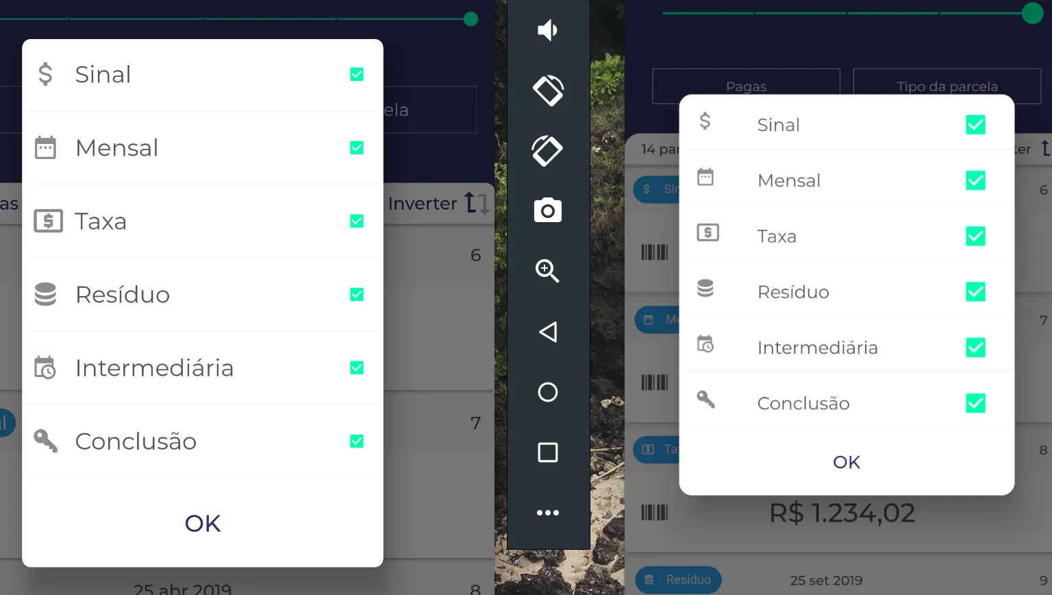
在平板电脑屏幕上,大小太小,如图所示。
你可以使用Transform.scale()!
它将帮助您管理复选框的比例。
            Row(
              children: [
                Transform.scale(
                  scale: 1.3,
                  child: Checkbox(value: mail, onChanged: (value) {}),
                ),
                Text(
                  "Recieve Mail",
                  style: TextStyle(fontSize: 18.0),
                )
              ],
            ),
不确定我是否能帮上忙,但看起来您是正确的,即当通过CheckBoxListTile Widget添加时,无法更改CheckBox的大小。
但是,您也可以通过插入每个使用的瓷砖的行来创建自己的瓷砖:
Row(
 children: [
  Icon(Icons.attach_money),
  Text("Sinal"),
  Transform(
   transform: myTransform, // I don't remember the correct syntax for this one
   child: Checkbox(
    value: true,
    onChanged: (_) {},
   ),
  ),
 ]
),
可以使用参数“visualDensity”来改变高度和宽度。
1-默认枚举的示例:
  CheckboxListTile(
      value: _isChecked,
      title: Text('Example item 1'),
      visualDensity: VisualDensity.compact,
    ),
2-使用自定义值的示例:
CheckboxListTile(
    value: _isChecked,
    title: Text('Example item 2'),
    visualDensity: const VisualDensity(horizontal: -4.0, vertical:-4.0),
    ),
     return Scaffold(
  body: Container(
    width: size.width,
    height: size.height,
    child: Center(
          child: new StatefulBuilder(
            builder: (BuildContext context, StateSetter setState) {
              return new Transform.scale(
                scale: 1.2,
                child:  Checkbox(
                   value: isChecked,
                    onChanged: (bool? value) {
                      setState(() {
                        isChecked = value!;
                      });
                    },
                ),
              );
            },
          ),
        ),
      ),


  );
更改Flutter复选框的大小、颜色和圆角,类似于以下内容:

              Transform.scale(
                scale: 1.2,
                child: Checkbox(
                  value: isBoxChecked,
                  checkColor: Colors.white,
                  activeColor: Colors.green,
                  shape: RoundedRectangleBorder(
                    borderRadius: BorderRadius.all(
                      Radius.circular(5.0),
                    ),
                  ),
                  onChanged: (isChecked) {},
                ),
              ),
我不得不进行一些修改,以使某些行为和约束更好
import 'package:flutter/material.dart';
import 'package:webshop/theme/data/sd_constants.dart';

class MyCheckboxListTile extends StatelessWidget {
  /// Whether this checkbox is checked.
  final bool? value;

  /// Called when the value of the checkbox should change.
  final ValueChanged<bool?>? onChanged;

  /// The primary content of the list tile.
  final Widget? title;

  const MyCheckboxListTile({
    Key? key,
    required this.value,
    required this.onChanged,
    this.title,
  }) : super(key: key);

  @override
  Widget build(BuildContext context) {
    return GestureDetector(
      onTap: () => onChanged?.call(value),
      child: Row(
        children: [
          Expanded(
              child: Container(
            padding: const EdgeInsets.only(left: 8.0),
            child: title,
          )),
          Transform.scale(
            scale: 1.5,
            child: Checkbox(
              value: value,
              onChanged: onChanged,
            ),
          ),
        ],
      ),
    );
  }
}