我想请您帮助我构建一个响应式设计。
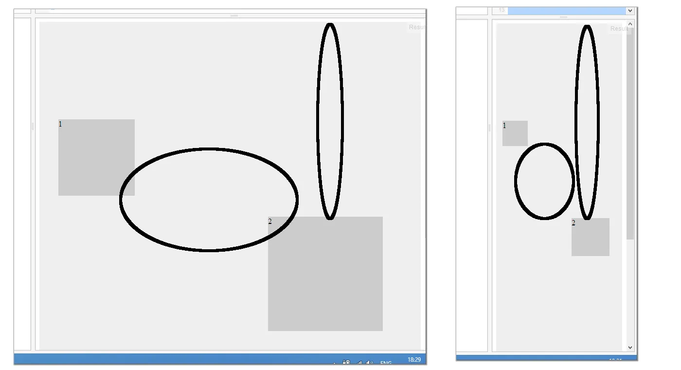
问题是我不知道如何将元素定位为绝对位置,但仍保持它们之间的顶部比例距离相同。
这里有一个示例链接,您可以调整窗口宽度,看到两个元素相互移动而不是始终保持它们之间的顶部间距相同。 所以我想要的是通过一些技巧来缩放整个内容,使其只变小/变大,但外观始终相同。
请问如何让元素在窗口调整大小时向上移动并缩小从顶部开始的空间?
.container {
    width: 100%;
    height: 1000px;
    position: relative;
    background: #eee;
}

.container div {
    height: 0;
    position: absolute;
    background: #ccc;
}

.elm1 {
    width: 20%;
    padding-bottom: 20%;
    top: 20%;
    left: 5%;
}

.elm2 {
    width: 30%;
    padding-bottom: 30%;
    top: 40%;
    right: 10%;
}